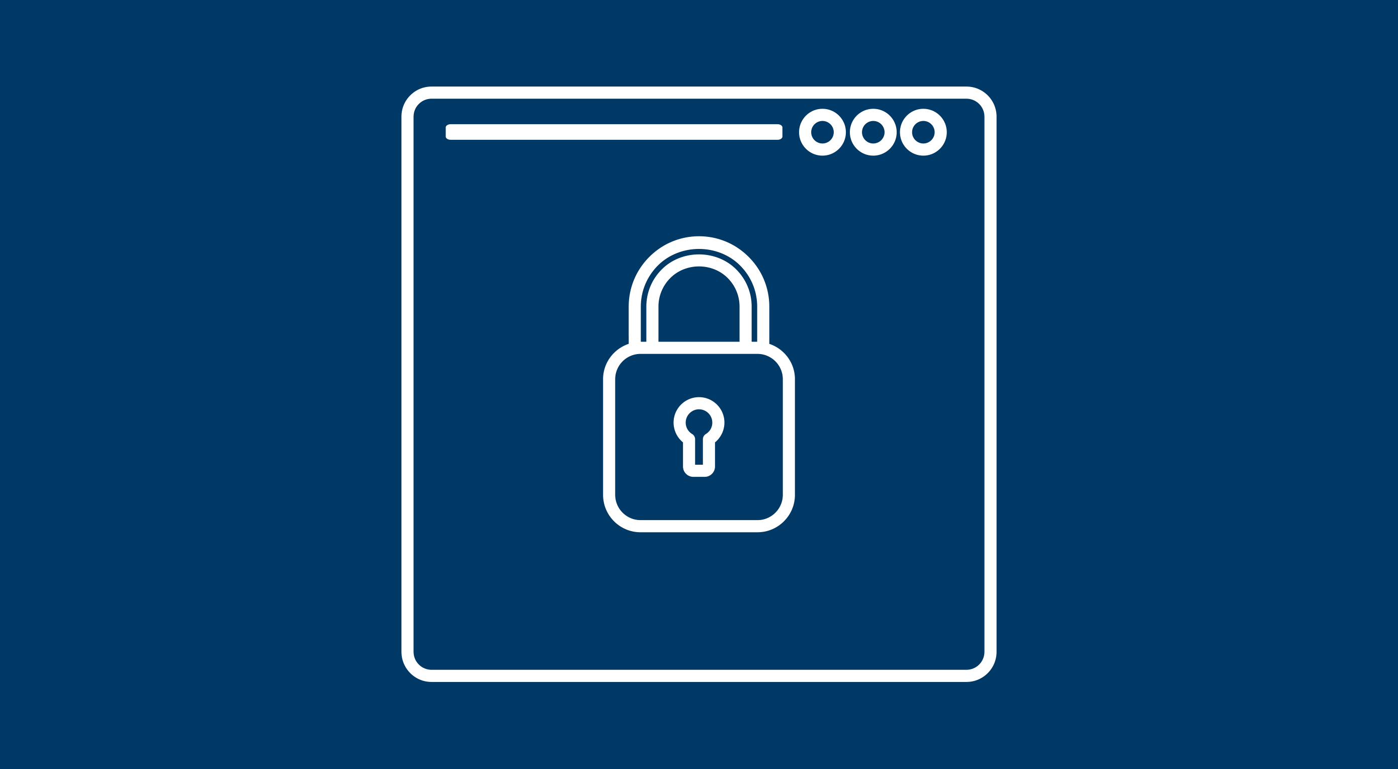
 WordPress has become the world’s most popular CMS. Because it is so popular, this is even more of a reason to enhance WordPress security if you are using it for your website. Most people understand how to make their page itself secure, but if you are not focusing on the the security of your WordPress site by limiting access to important files and folders, then you are still at risk. To do this you will not be making any changes to WordPress itself, but rather altering how WordPress runs on a server and how much access users have to its files.
Step 1: Limiting access to wp-includes folder
WordPress sites are comprised of a series of files and folders, each with their own unique URLs, which means if someone were to type in the correct URL they could access or alter sensitive files that run your site. One of the most common targets for this kind of hacking is the wp-includes folder, so we are going to add some additional code to the server configuration file to beef up security and prevent these kinds of threats. When we are done with this, anyone attempting to access these files gets redirected back out.
To start you will want to open up the .htaccess file for your site. You can do this through any text editor, doesn’t matter which because all we are doing is adding a little snippet of code to the file. You will notice that the file already has code in it, generated by WordPress. In one of the early lines of code, you will find a line that says # BEGIN WordPress. Directly above this code, we are going to add the additional lines of code, which will fortify the site’s defenses by restricting access to the wp-includes folder.
# Blocking web access to the wp-includes folder
<IfModule mod_rewrite.c>
RewriteEngine On
RewriteBase /
RewriteRule ^wp-admin/includes/ - [F,L]
RewriteRule !^wp-includes/ - [S=3]
RewriteRule ^wp-includes/[^/]+\.php$ - [F,L]
RewriteRule ^wp-includes/js/tinymce/langs/.+\.php - [F,L]
RewriteRule ^wp-includes/theme-compat/ - [F,L]
</IfModule>
Afterward, you simply need to re-upload the file to the server and you’re done. While the changes here seem minor it can have a large impact on your site’s defenses. Because many of the advanced functions of WordPress are located within the wp-includes folder, they are a major target for hackers to go after. With these changes implemented, when users attempt to access this folder, they will instead be automatically redirected to the front page of your site.
Step 2: Protecting wp-config.php
Our next step to fortify WordPress security is to limit access to the wp-config.php file. When you first created your WordPress site, you had to create a database name, username, password, and table prefix, which is contained in the wp-config.php file. The reason you want to protect this file is because it contains the information WordPress needs to talk to the database, and in the long run, control your site.
To protect your wp-config.php file, you will just need to do a few simple steps. First, we will want to open up the .htaccess file again. Next, we will want to copy the snippet of code below and paste it into our .htaccess file just like we did with step 1.
# Blocking web access to the wp-config.php file
<files wp-config.php>
order allow,deny
deny from all
</files>
Finally, save and re-upload the file.
Step 3: Defending the .htaccess file itself
As you can see with steps 1 and 2, the .htaccess file can be intrinsic to defending your WordPress site from malicious external threats. That is why in this step we are going to protect the .htaccess file itself, preventing hackers from removing the protections we’ve already put in place.
To do this we will again open up the .htaccess file. Next, insert the code below in to the existing code.
# Securing .htaccess file
<files ~ "^.*\.([Hh][Tt][Aa])">
order allow,deny
deny from all
satisfy all
</files>
And with this simple addition, your .htaccess file is protected from outside threats.
Step 4: Removing file editor access
For the final step we are going to be denying hackers access to one of the most destructive tools they could get their hands on: the Editor inside the WordPress dashboard. It allows you to edit your theme files, which is helpful but can be dangerous. If a person, other than yourself would get access to this, then they could change your code and break your site.
With this project, we will be removing the Editor from the WordPress dashboard. Rather than accessing the file through WordPress, I recommend that you access it through an ftp client such as FileZilla, which is better for site integrity.
So to do this project we will first want to open up the wp-config.php file. Once we have that open, we are going to go to the end of the code, here you will find the text “That’s all, stop editing! Happy blogging.”. Right before this text we are going to add the code below to remove file editing entirely from WordPress.
define('DISALLOW_FILE_EDIT', true);
Once you have added the code, save the file and re-upload it to the server. Now your WordPress site is safe from anyone gaining access to your site and trying to manipulate the code.
Know that your site is safe
If you follow all of these steps, your site should be much safer. By reducing the amount of access hackers have to the files important to running your site, you have increased your WordPress site’s overall security.
Source 
from Webdesigner Depot https://www.webdesignerdepot.com/2017/04/the-designers-4-step-guide-to-securing-wordpress/
 Every week users submit a lot of interesting stuff on our sister site Webdesigner News, highlighting great content from around the web that can be of interest to web designers.


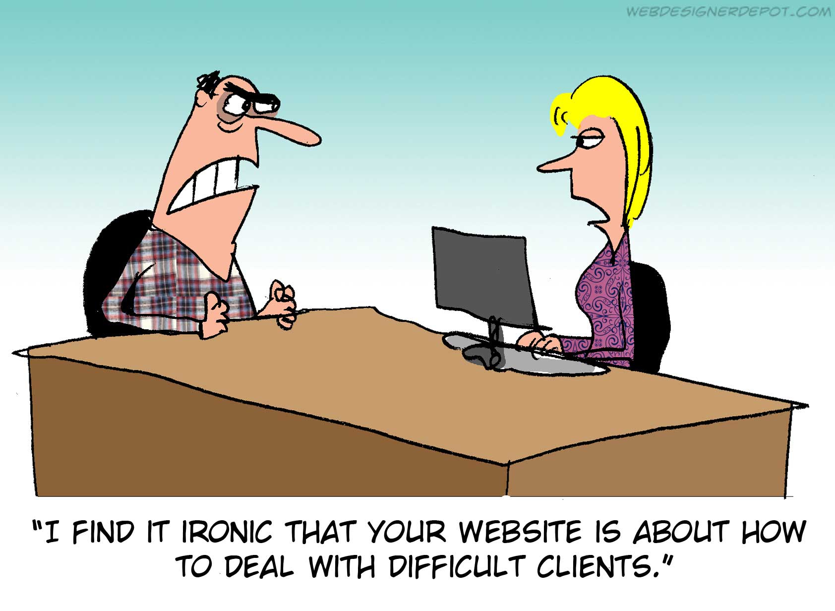
 Every week we feature a set of comics created exclusively for WDD.
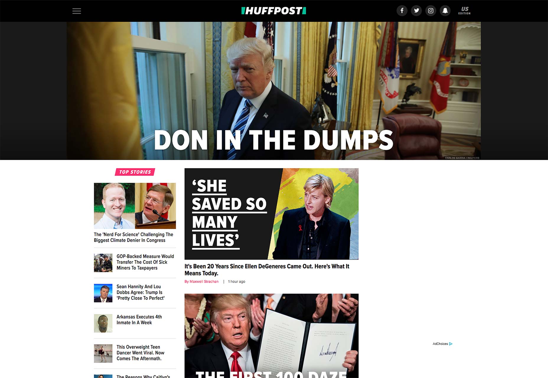
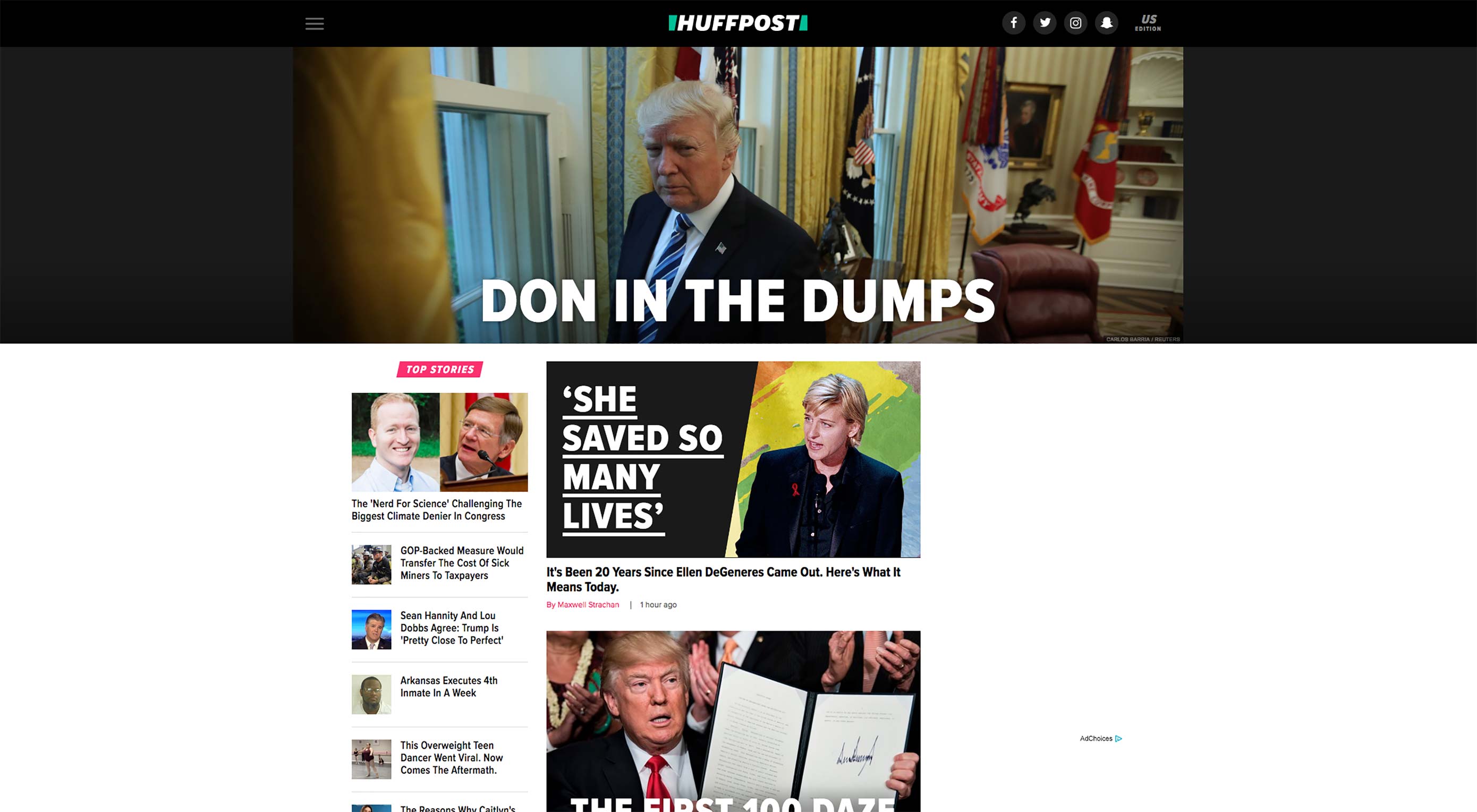 The Huffington Post, now officially referred to as “Huffpost” has a completely
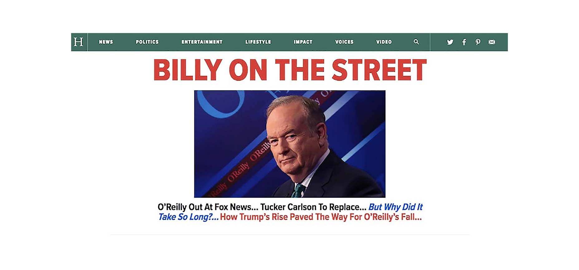
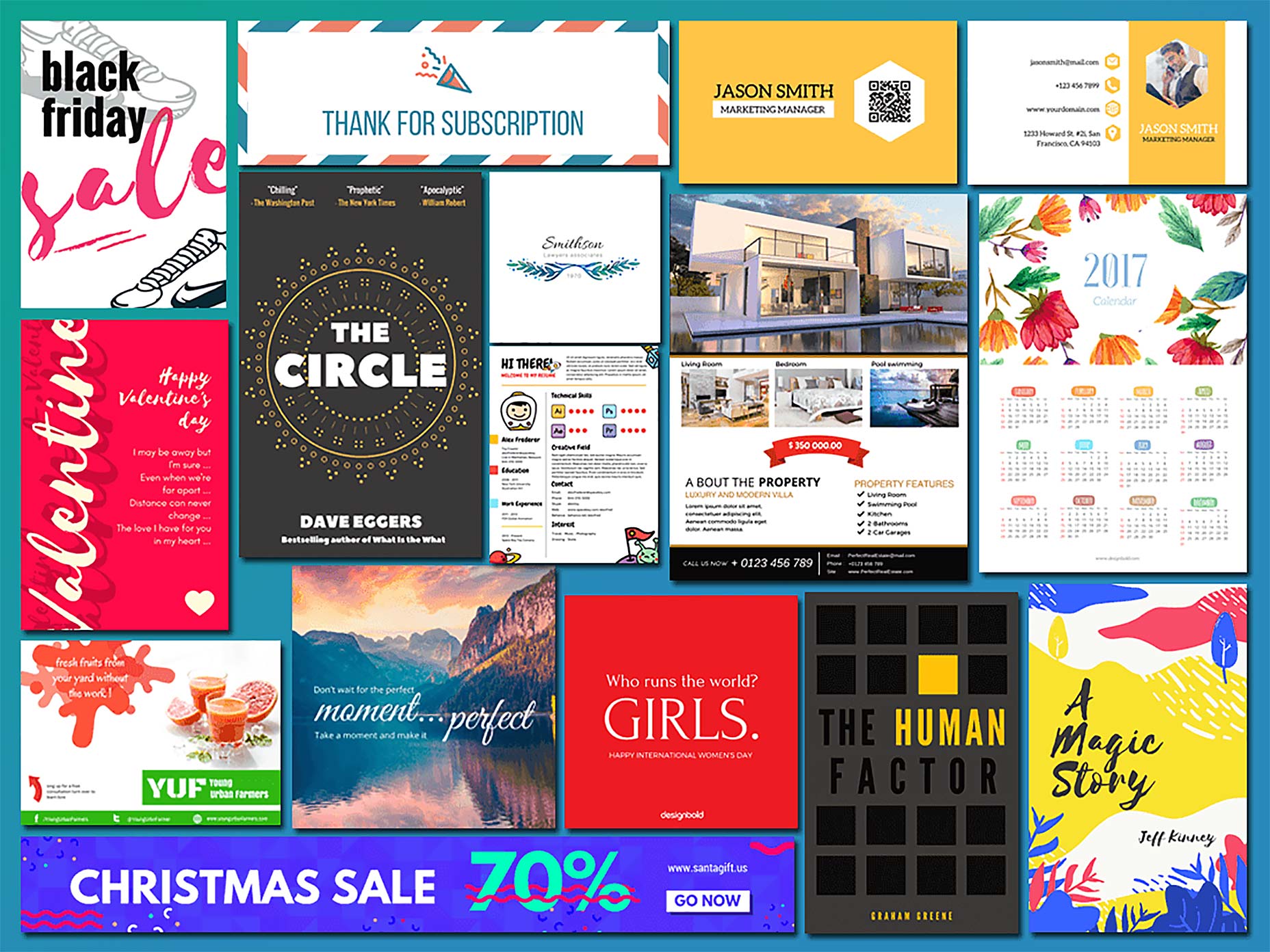
 Every designer needs a kickass toolbox to fall back on. Whether you’re an accomplished designer who’s looking to save time, or a newbie still honing their skills, a great big pile of design assets will bail you out of many a tight corner.
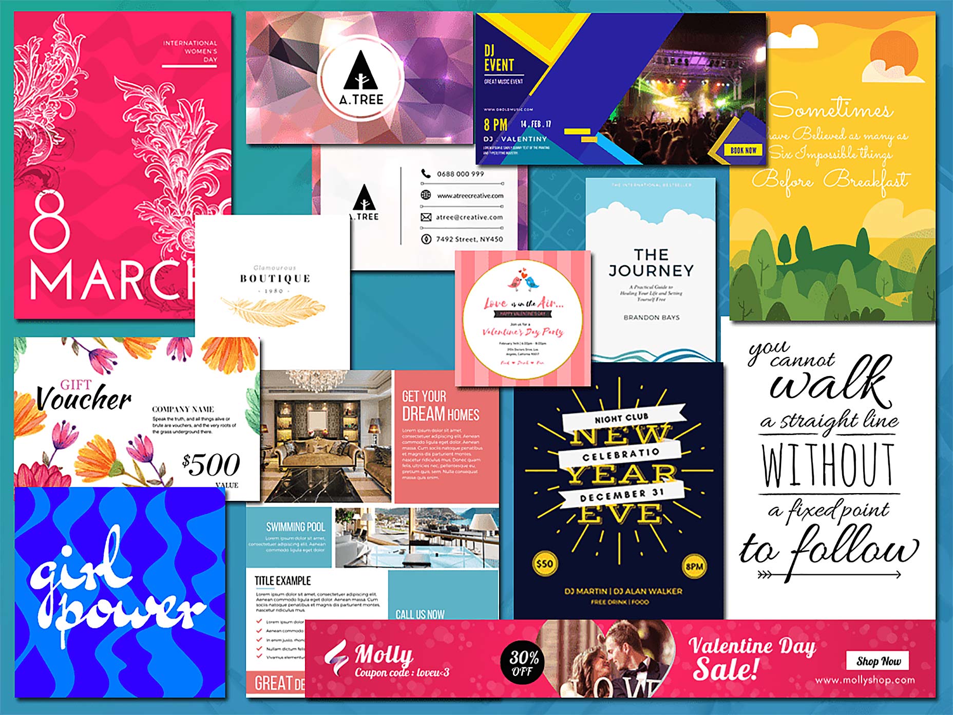

 “The best products do two things well: features and details. Features are what draw people to your product; details are what keep them there” says Dan Saffer. The importance of details can’t be over-emphasized. Details make users love or hate an app or website. Microinteractions are those details. They might be easily overlooked in the global design scheme, but they actually hold the entire experience together.


