Thursday 29 June 2017

How to Design Banners That Clients Will Love

Before you start working on creating your client’s banners, you’ll need to understand who they are targeting and what they wish to achieve with their banners. Objectives can include the following: generating brand awareness; product awareness; increasing website traffic; generating leads; making a sale; signing up to an event.

The audience the client wants to target is just as important as their objective. If you can understand their audience, you’ll be able to create ads that resonate with them. Below are two adverts from IT companies that are in the same market but target a different customer base.

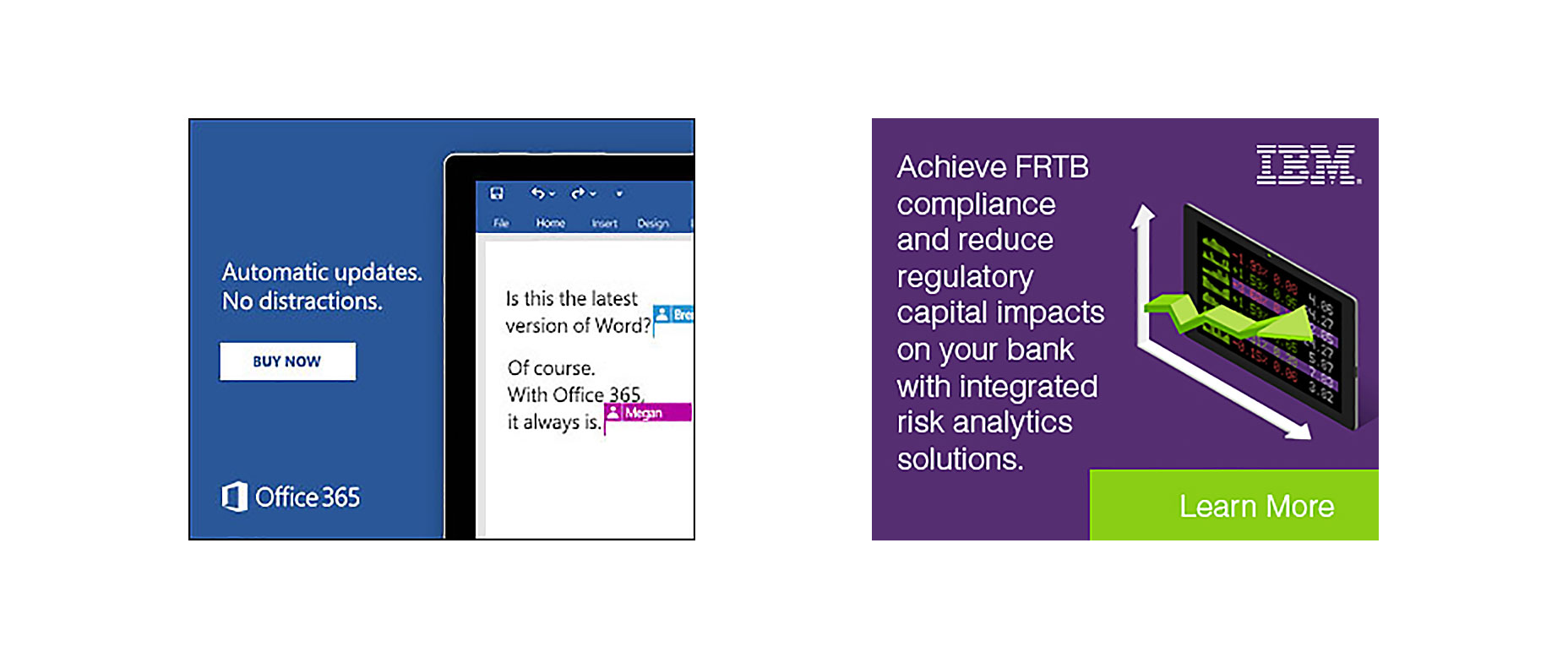
Microsoft’s advert focuses on consumers, and their message is written in a simple, jargon-free way that anybody can understand.

IBM cater primarily to B2Bs and have used professional and business-like words such as regulatory and compliance that will resonate more with c-level executives than everyday consumers.

Personalization and Localization

75% of consumers say they are frustrated when a business serves them content, such as ads, that are not relevant to their interests, whereas marketers who do use personalization notice, on average, a 19% uplift in sales.

Personalization and localization is key to creating successful banners. With the average consumer consuming thousands of ads per day, anything that is not relevant to their interests will be ignored.

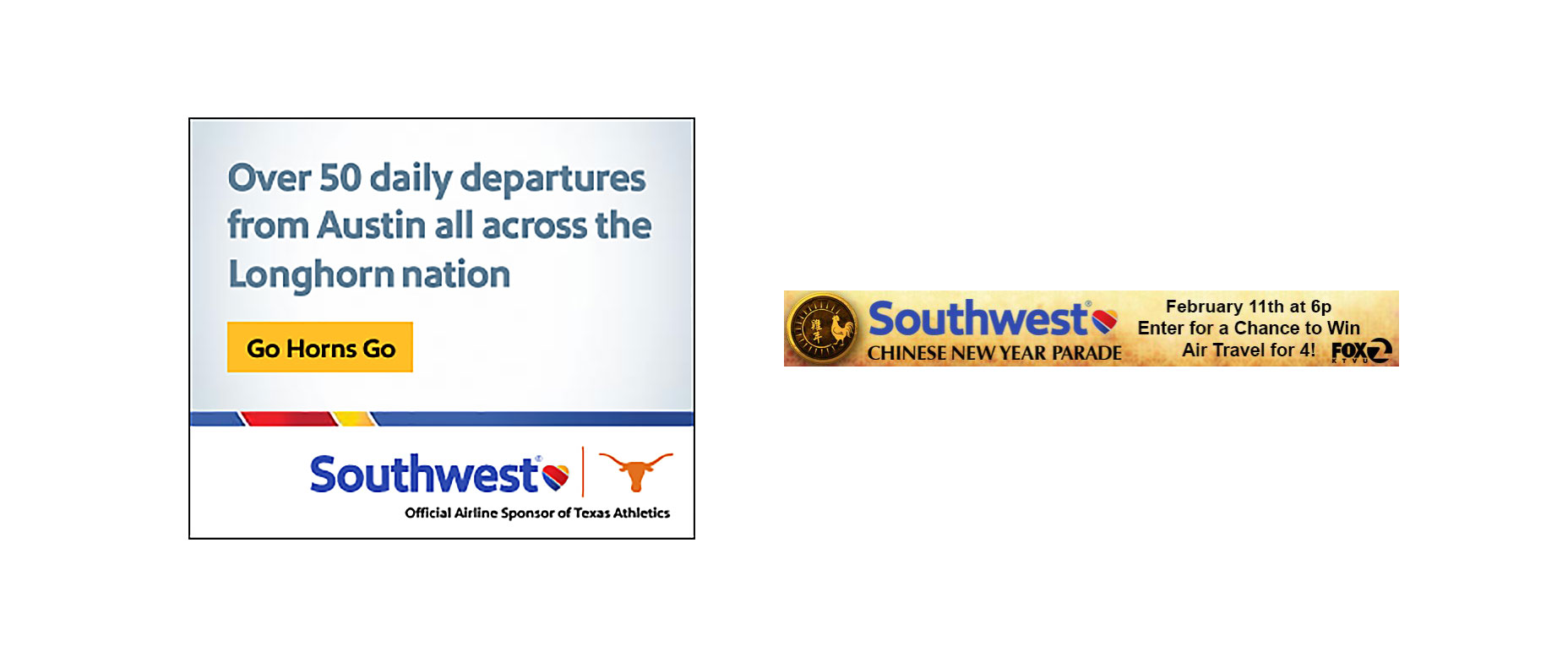
Here’s an advert from Southwest targeting consumers living in Austin, Texas. This banner hits on three points of personalization and localization. Their advert shows the state’s national stadium, and it also has the state, city, and nickname of Texas to catch the customer’s eye. During the Chinese New Year, they leveraged the national Asian holiday to set up a sweepstake (lead generation campaign) to win free flights for four people. You can personalize an advert based on what you know about the audience, the geo-location of that audience, or by tagging in relevant seasonal holidays or current pop culture trends.

Color

There are two things you need to consider when choosing the right colors for your client’s banners: brand colors and color psychology.

Brand colors: these are the colors used by your client on their website, logo, and other marketing materials. 

Color psychology: this is the effect certain colors have on our minds; different colors have been proven to evoke various emotions in the human brain.

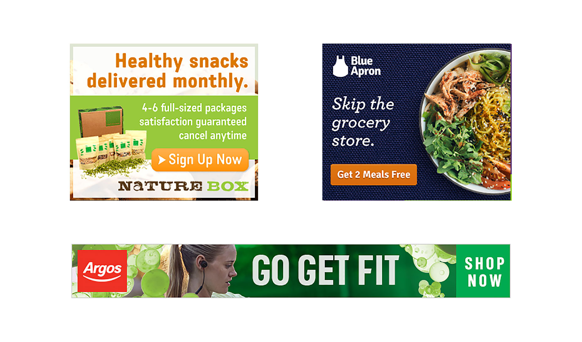
For example, the color green is known to relax us and is often the color used to indicate an environmentally friendly approach. This color psychology has been leveraged to full effect by Nature Box who use green as the primary color of their advert.

Blue Apron is another food brand that promotes healthy eating with one of their USPs being that there is no food left over. However, unlike Nature Box, they tend to focus more on their brand colors (blue) than color psychology.

Sticking to their brand colors, Blue Apron are still able convey the message of healthy eating by using relevant images.

Argos, whose brand colors are red and white, also plaster their fitness related advert with the color green to further empathize their message of health.

Brand Colors or Color Psychology?

There is no right or wrong answer. Look at your client’s past adverts and view the colors and images they used so you can keep their brand consistent across all platforms.

This should also be discussed before work begins so you know the parameters that you can work within.


Words and Imagery

Words and images go hand in hand. The image should further emphasize the text and the text should further emphasize the image.

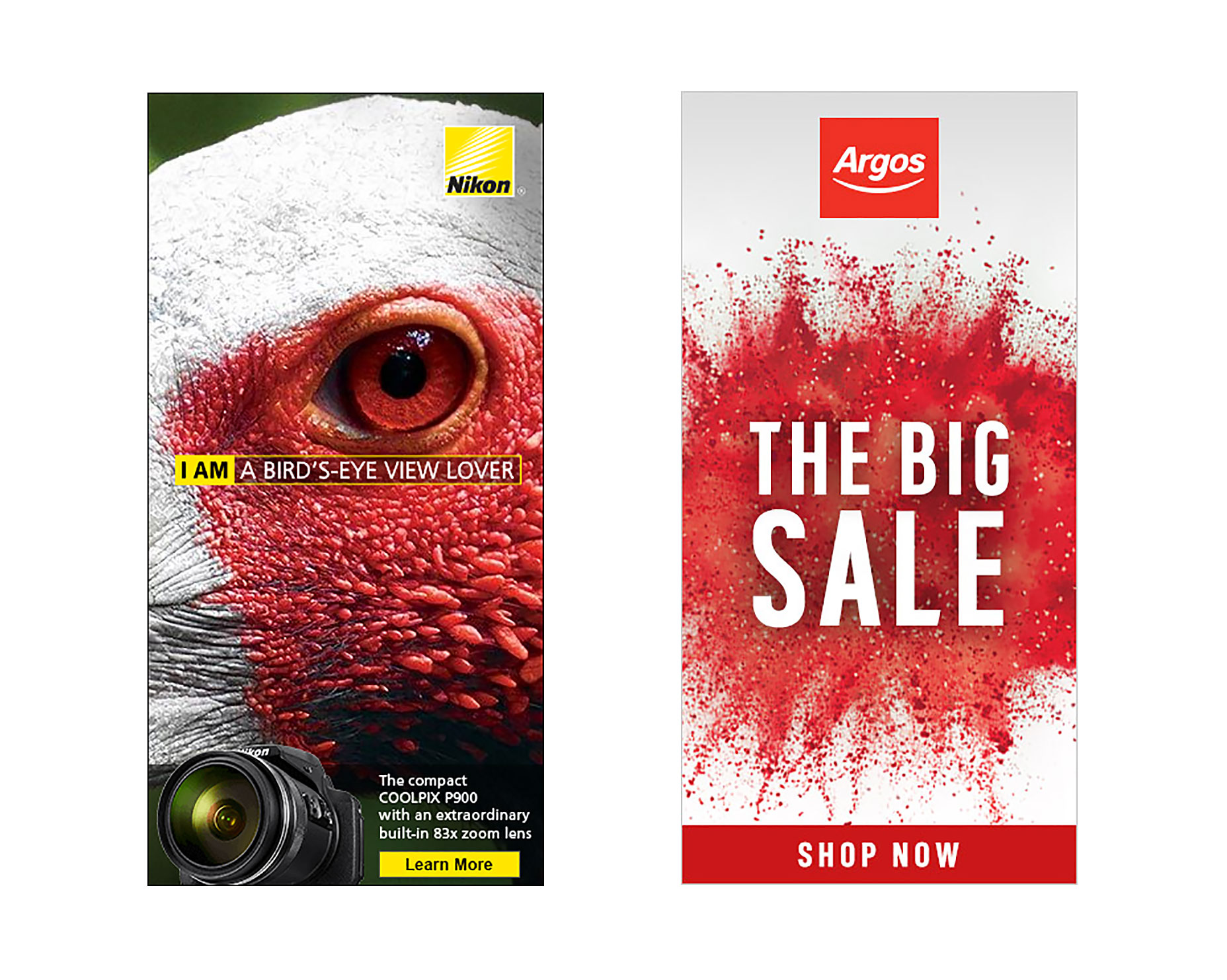
Take this Nikon banner advert as the perfect example. It uses images and word psychology to portray how powerful their camera is. Birds are known for their great vision, with many having the ability to see for miles. The text “I am a bird’s-eye view lover” is reinforced with the image of the bird as the focal point of the advert. At the bottom of the advert is a small call to action, which showcases the camera’s power with a built-in 83x zoom lens. You can get creative when mixing words with images, and you needn’t limit your image choices to your client’s product range.

Argos, who were running a huge sale, used the words “THE BIG SALE” with a colorful red explosion in the background. Notice that when they don’t focus on health, they have gone back to red (brand color) – a color which has also been proven to increase urgency.

During the communication stage of your project, ask your client what words they would and would not like mentioned in their adverts. Certain brands want to retain their hard-to-obtain and luxury status and avoid using words like discount, free, sale, or save. Some may not want you to use cartoon graphics or certain animation effects because it may damage their band.

Calls to Action

Not every advert you create will need a call to action, but most will. A call to action must be easy to see and match the page the user is sent to.

When using call to actions, you must analyze the page you’re sending traffic to in order to create the base of your advert.

To reach your client’s objective of securing a sale, signing up to their website, or reading a blog post, you need the user to stay on their website once they click the advert. Customers may leave directly after clicking if there is no ad scent, that is the experience they see on the website is totally different from the advert banner they viewed.

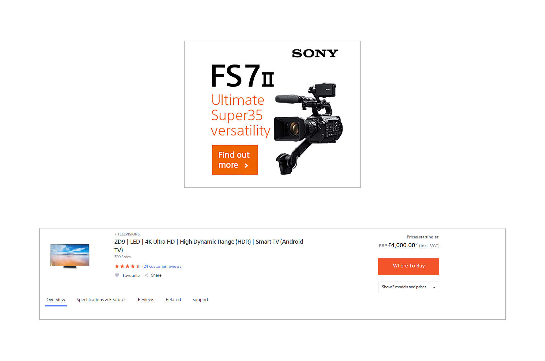
Sony’s banner ads and website have a strong ad scent as they use the same color, font, and white space in both their advert and website.

Call to actions should also pass the squint test.

The squint test is a simple way to detect whether your call to action stands out or not. To perform the squint test, take three steps away from your monitor, squint your eyes, and if you cannot clearly spot the call to action button, your call to action needs to be adjusted.

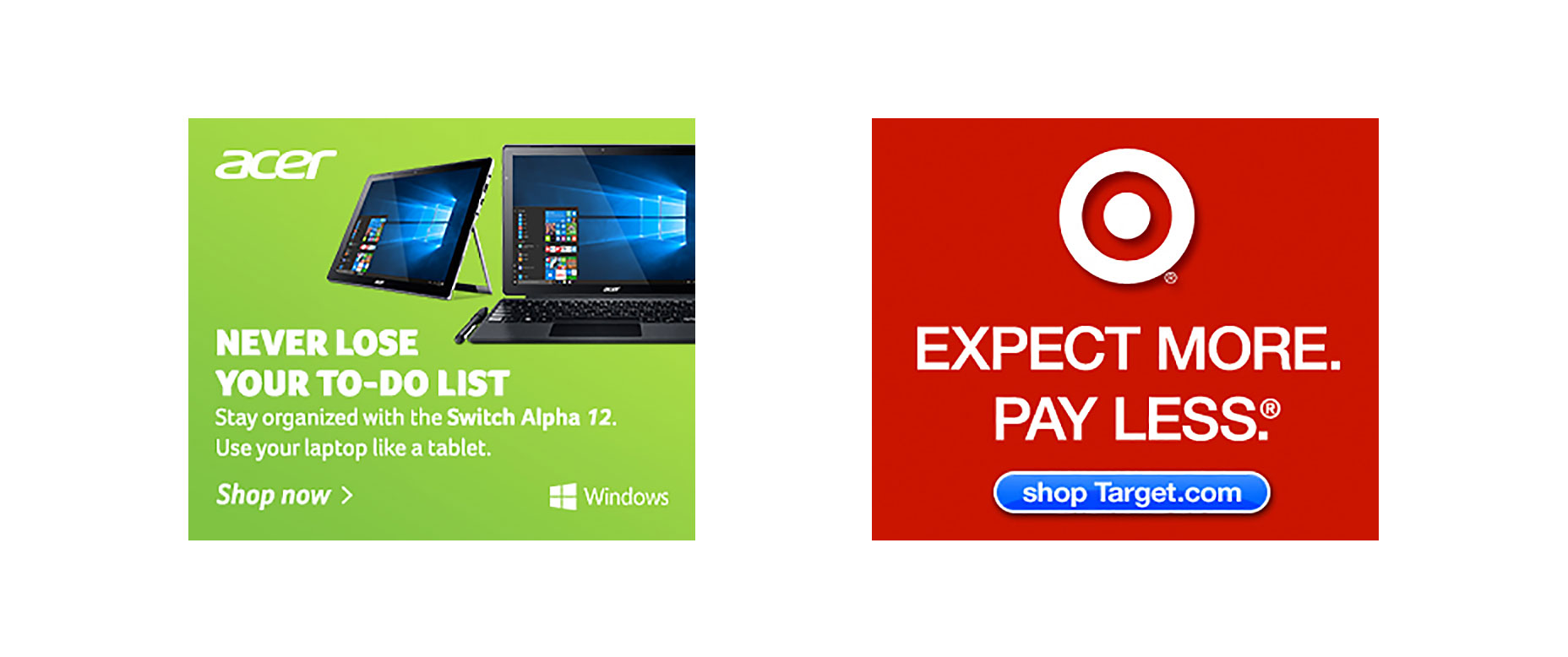
Here’s an Acer advert. Does it pass your squint test? Nope, ours neither. The entire background is green and it’s hard to identify where the call to action is as nothing in that advert is popping out urging us to click.

What about Target’s advert leading users to their online shop? Does this pass your squint test? Yes, we can see it too.

To create a clear call to action button, ensure it stands out from the background and, if possible, use a unique color that hasn’t been used in the image.

Position the button away from the feature image and let it breathe so it can stand out more. Most call to action buttons are directly underneath the image and text, as the customer first consumes the content and is then presented with a decision to click or not.

You will rarely see the call to action button at the top of the advert with the text and image at the bottom or at the left of an image.

Promotions and Offer-Based Banners

The primary objective for your clients will be to win more business, and most will do this by offering some type of offer or discount on their products.

As a designer, you may not have data on your client’s bestselling products or most viewed item, and you may end up choosing a product image that you think looks good but actually doesn’t sell that well.

As a creator of images, one of your tasks should be to learn more about your client’s customers and products. The difference between showing their bestselling item and an item that hardly anyone buys can be huge for click-through rates and conversions.

The more data you have, the better you can choose product images to reach the client’s desired goal.

Animation

As websites become more flexible, there are dozens of widgets and pieces of content that attracts the human eye. In most studies, animation banners always outperform static banners, but they can also end up annoying the user and devaluing your client’s brand if done incorrectly.

While you want customers to click your banners, you don’t want to turn your banners into what we call ‘eye-bait’ (similar to click-bait). Eye-bait is when you use contrasting background colors or fast flashing images for the sole purpose of getting users to view your advert when on a website.

As a general rule of thumb, the background of the image should not change color, only the text or images on that page should.

The best animation adverts lead the customer through a quick story as can be seen by this Samsung advert.

samsung

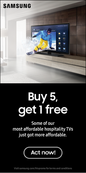
It first reveals the product and our eyes focus on it; then comes the text that redirects us to the second part of the story. Finally, we’re shown the call to action button which jumps out at us telling the user’s subconscious mind that the next appropriate action is to click and learn more.

LAST DAY: The Gibon Font Family – A Complete Comic Book Lettering Kit – only $12!

Source

from Webdesigner Depot https://www.webdesignerdepot.com/2017/06/how-to-design-banners-that-clients-will-love/

Wednesday 28 June 2017

Foundation 6.4 Released

Foundation 6.4 has been released by the team over at Zurb, and while it’s packed with tweaks and improvements that you’d expect from any release, the big news is that the Flexbox-based grid is now the default layout tool.

XY Grid

The new grid is called the XY Grid, and it’s truly powerful thanks to the underlying Flexbox technology. In the XY grid you can control layouts both horizontally (x) and vertically (y) thanks to the super-amazing power of Flexbox.

Foundation has been playing with Flexbox for a while, in fact it was one of the first frameworks to adopt Flexbox as a layout option. Adopting new technology in this way is one of the things that’s kept Foundation ahead of the pack.

All we’ve been hearing about for months is CSS Grid for layout, but actually CSS Grid is still cooking with support not quite there yet—support for Flexbox is consistent across the board which makes Foundation 6.4 the way to layout websites. Of course, the old style grid is still there, for those people that need legacy support, but the XY Grid is so cool, you’ll want to stick with the new default.

ES2016

Foundation 6.4 also adopts EcmaScript 2016 standards, in practical terms the most up-to-date JavaScript there is. ES2016 moves us further towards OOP JS and that means far more efficient scripts, that run faster and enable better user experience.

Again, there’s some backwards-compatibility options, so don’t panic if you’ve got client sites that you don’t want to update, or seriously backward browser requirements.

Prototyping

Foundation was built as production code. Despite this lots of people (seriously, lots) use Foundation for rapid prototyping—sometimes you just need to throw together a working prototype, take it to users, and gather their feedback.

Unfortunately, it’s not always been clear which parts of Foundation were designed to enable rapid prototyping. The fallout from that being that occasionally, unwitting developers would push prototype-standard code out to a production environment. Sad gifs all round.

Zurb are tackling that in Foundation 6.4 by giving us a whole heap of prototyping helpers and even a “prototype mode” to speed up prototyping. This smells like something that’s going to evolve in future!

Get Foundation 6.4

Foundation 6.4 looks like being one of the best updates yet: tons of performance improvements and a whole new way to layout sites thanks to the XY Grid.

Foundation 6.4 is free to download from Zurb, and if you’re excited about getting up to speed on the XY Grid Zurb are running free webinars tomorrow (Thursday 29th June) and Friday (30th June)—make sure you sign up fast because there’s limited spacing.

Smartmockups App: The #1 tool for creating stunning marketing images – only $19!

Source

from Webdesigner Depot https://www.webdesignerdepot.com/2017/06/foundation-6-4-released/

5 UX Truths Cats Can Teach Us

Cat pictures and GIFs make the web go round. That much is obvious to anyone who has used the web at all in the last couple of decades. But cats aren’t just great content. They’re great companions for those of us too busy to take care of dogs.

They’re smart little fluffy things, though. Over the millennia, cats have learned exactly how to manipulate us into giving them what they want…most of the time. Indeed, they’ve learned many ways to make us want to give them the things they demand. There’s a really strong case for the idea that all cat owners just have really bad Stockholm Syndrome.

From cats, we can learn to form relationships with people with whom we may not have much in common

Now I’m not advocating Stockholm Syndrome as the key to your site’s success. Being as demanding or sneaky as some cats are would backfire horribly. I’m suggesting that there are things we can learn from the ways that cats dig their little foot-knives into our hearts. From cats, we can learn to form relationships with people with whom we may not have much in common.

1. Give and Take

The first thing that any smart cat learns is that you don’t get your nightly tuna snack for free. The deal with my fiancée’s cat is that he has to be back inside by 10PM. As he is now an indoor cat, he meets this demand easily enough. My cat has (mostly) realized that she pays for her tuna in cuddles, nose boops, and by hopping into my lap while purring and demanding affection—she understands her side of the deal.

You gotta deliver quality (metaphorical) cuddles to earn loyalty

Now, you might not have the chance to cuddle with your site’s users and shed fur on them. You just need to understand that when a user comes to your site, you’ve just entered into a deal. So long as your site provides them with what they need and/or want, they’ll stick around and give you their attention, and perhaps their money. Tricking users is a short-term solution. You gotta deliver quality (metaphorical) cuddles to earn loyalty.

2. Make Your Needs Known

Cats don’t meow at each other. They meow at us, because apparently, it’s the only thing we understand. And even then, it’s hard to tell one meow from another, so I end up checking their food, water, litter boxes, and anything else that might be wrong before I realize that the little brat wants to go outside, but he isn’t allowed.

If you need action or input from your users, you need to make this painfully, sometimes ear-splittingly clear. Unlike cats, you can actually tell your users exactly what action or input you need. This is why buttons have to look like buttons, links have to look supremely clickable, and don’t even get me started on forms.

3. Move on From Your Mistakes

You ever see a cat screw up while rolling around and fall off the bed or couch? It’s amazing. Watching these graceful little creatures completely fumble a jump is one of life’s great pleasures. Cats are skilled in moving past their mistakes. After an initial expression of mild shock, a cat will promptly right itself and get back to doing cat things. Cats don’t sit there on the floor pretending they meant to do that. They get up and solve the problem, then pretend they meant to do that.

Cats are skilled in moving past their mistakes

In design, as in life, you can’t cling to your mistakes, whether your security was hacked, you spent too long on a UI idea that was never going to work, or you just made a typo in the CSS. You have to get back on your feet, then set things aright, or start over. And you have to do this as quickly as possible, so as to not lose momentum. The caveat is that we don’t get to pretend it never happened. Improvement requires admitting your mistakes, and apologizing to anyone they might have adversely affected.

4. Delight Your Users by Being Yourself

One of the joys of living with cats—one never truly owns a cat—is watching them do cat things. When they roll over and sleep with their bellies to the sun, you can’t help but smile. When they dose in a pose so regal, you’re reminded of a Sphinx, that’s just adorable. When they play fight, hunt, chase red dots, or inhale their tuna like addicts, they are just being themselves. And we love it.

Projecting a false personality to your users will always backfire eventually. If you are into cheesy humor, write cheesy copy. If your company maintains a highly formal environment, make your site formal. Take the best of yourself (or your company), and invest it into the site itself. If nothing else, your users will appreciate the honesty. In a best case scenario, they’ll grow attached.

5. Take Care of Your Users

When a cat brings you a dead animal, or worse, one that’s not quite dead yet, they’re just looking out for your well-being. They never see you go hunting, and assume that you must be terrible at it, opposable thumbs and tuna cans notwithstanding. So they’ve gone hunting for you, and they really want to teach you how. It’s messy, but well-intentioned.

first and foremost that users are people before they are customers

Show your new users around the site, if it has any complex functionality. Take care of their personal info, do your best to avoid leaks. Give them the best customer service you can. Remember first and foremost that users are people before they are customers. Demonstrate loyalty to the people who use your site, and they’ll be loyal to you. Take care of them, and they’ll take care of you.

Smartmockups App: The #1 tool for creating stunning marketing images – only $19!

Source

from Webdesigner Depot https://www.webdesignerdepot.com/2017/06/5-ux-truths-cats-can-teach-us/

Tuesday 27 June 2017

9 Exciting Open Source Sass Frameworks

Every CSS developer should know about Sass to see what it offers. This superset of CSS has revolutionized stylesheets much like jQuery revolutionized JavaScript.

And alongside many CSS UI frameworks we also have SCSS/Sass frontend frameworks. Most of these are pretty new but gaining traction quickly.

We’ve curated 9 of the best free SCSS frameworks here so if you’re a Sass user then you’ll definitely want to check these out.

1. Sierra

The Sierra framework is touted as one of the lightest and smallest SCSS frameworks on the market. Currently in v2.0 it weighs a total of 37KB.

This may not be literally the smallest option out there, but even the minified Bootstrap stylesheet totals ~120KB so Sierra is pretty light. It’s also well organized with separate files for mixins, buttons, tables, typography, and other common page elements.

This file separation is standard for Sass development and it makes your job much easier when customizing the framework.

You’ll find a complete live demo with all the main elements on Sierra’s main page along with setup documentation on GitHub. I’d rate this in the top three of all Sass frameworks so it’s definitely worth a look if you’re curious.

2. Scooter

The team at Dropbox put together their own frontend framework called Scooter. This one is a lot simpler than most since it was created for frontend prototyping.

Dropbox actually has a lot of open source stuff on GitHub which includes their own style guide for formatting CSS/SCSS code. This little resource can prove incredibly useful if you wanna dive into Scooter and tinker with the default source.

Most of the Scooter styles actually borrow ideas from Dropbox like their buttons on the components page. This offers a cool way to prototype your own webapps in Sass while using a tried & tested UI style.

3. Kickoff

For something a little more detailed you might try the Kickoff library. This runs on a Sass base and has its own naming scheme for adding new variables.

But Kickoff mixes a little bit of everything from CSS grids to more complex JS components all delivered & maintained through Gulp.js.

If you don’t already use Gulp then this framework has a bit of a learning curve. But the entire codebase is very future-centric with a focus on ES2016 and flexbox.

This is exceptionally lean with a CSS stylesheet of only 8.6KB and a measly 2KB of JavaScript. Kickoff is meant as a boilerplate where it’s merely a starting point, so you can build out something as slim or detailed as necessary for any project.

Take a peek at their online demo to see how this looks in the browser.

4. Materialize

Everyone knows about Google’s material design and how fast it spread across the web. This led to many developers creating their own stylesheets to mimic Google’s guidelines and some of those stylesheets are online for free.

Materialize is one example of a CSS/Sass framework built specifically on Google’s guidelines. The framework is still technically in beta version 0.9 as of this writing.

But I’d argue it’s complete enough for production websites and there’s a Sass option right on the intro page. So you can either download the basic CSS/JS files or get the CSS+Sass for further development.

This is so popular that it’s available on CDNs so you don’t even need to download the CSS locally.

Anyone conforming to Google’s material styles should absolutely start with the Materialize library. You’ll find complete documentation on the website along with a showcase of websites running Materialize.

5. Hocus-Pocus

The Hocus-Pocus framework doesn’t consider itself a framework, but rather a starter’s kit for designing new projects.

This UI kit restyles all the default HTML elements on a webpage and it comes with a nice responsive grid to align those elements. Naturally the whole thing relies on Sass which makes the dev process a lot simpler.

Hocus Pocus feels more like the antithesis to Bootstrap. You wouldn’t use this directly on a live website. But you would use this as a starting point to prototype and build ideas quickly. Although it can work well as a base too since it runs on Normalize.

From pre-styled tables to buttons and custom form elements, Hocus Pocus adds a minimalist touch to all default browser styles.


6. Gridle

The Gridle framework is one of the most customizable SCSS grid frameworks you’ll find. It’s powered by Sass and it comes with dozens of custom mixins and functions made specifically for this grid system.

You’ll find a live preview on the demo page here hosted for free on GitHub. There’s also a complete setup guide on the main repo that covers how to define grids from very simple to more complex.

Note that Gridle does require some existing knowledge of grid systems and it’s certainly not a magic bullet.

But it’ll save you hours of time hand-crafting a grid from scratch, not to mention it’s reusable for pretty much any project you design.

7. iotaCSS

One of the best methods for structuring CSS is the OOCSS style. This follows an object structure where you design for more classes & relationships rather than nested specificity.

iotaCSS is one of the few OOCSS frameworks and it’s real easy to use. You can browse through a mini preview of the source code to see naming conventions and how this uses BEM/OOCSS syntax.

One unique difference about iota is that it’s not specifically a UI kit. Instead it’s a framework to help you create a UI kit solely through Sass. This means it’s not a plug & play solution, but it also offers far more customization.

The online documentation is phenomenal so this is a fantastic framework to build out your own Sass-powered stylesheet from scratch.

8. Bulma

Modern CSS is moving towards a modular and flexible structure with flexbox. This seems to be the new normal and Bulma is leading the charge.

This free Sass framework lets you work solely with flexbox to create fully responsive grid systems from scratch. This means easy vertical + horizontal centering, fixed-height grid boxes, and a whole bunch of default styles.

You can find live demos on the main page along with install instructions on GitHub.

By default Bulma is just a CSS file and it’s even hosted on CDNs for free. But developers are encouraged to download the Sass files and work with variables to add your own features.

9. Susy

Susy is a responsive Sass toolkit for building layouts from scratch. It’s a unique library because it doesn’t come with a default grid setup or a stylesheet ready to launch.

Instead Susy offers a series of tools with tutorials that you can follow to create your own grid layouts.

These various tools let you define variables for custom breakpoints, custom grid/gutter settings, and toss in a variety of mixins for good measure. You can style nested elements quickly and target very specific page elements with just a few lines of code.

Since this doesn’t come with a default stylesheet it’s not a ready-to-go solution. But if you’re a Sass developer looking to save time then skim through Susy’s docs and see what you think.

800 High-Resolution Retro/Vintage Style Photos from Cruzine – only $14!

Source

from Webdesigner Depot https://www.webdesignerdepot.com/2017/06/9-exciting-open-source-sass-frameworks/

Monday 26 June 2017

10 Ways to Design Menus That Don’t Suck

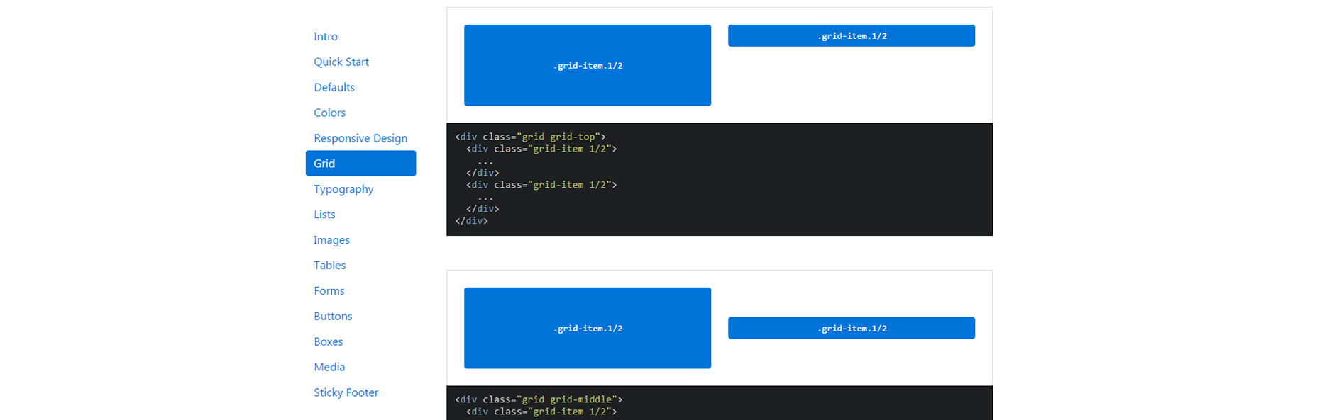
There are definite right and wrong ways to design navigation menus. This basic part of a website is often overlooked in the design process and it shows in terms of usability.

Clunky, overcrowded or missing navigation are the most common issues and quite frankly they can make your website simply suck. Don’t be that guy (or girl). Use these tips to ensure that you are using modern navigation patterns in your website projects for cool, creative navigation elements that don’t suck. (And are highly usable.)

1. Ditch the Mega Menus

Mega menus was a design fad that clients loved—even when designers hated it. The oversized menu style that includes “everything but the kitchen sink” is overwhelming to users and doesn’t provide any real value.

Only a handful of major retailers can really get away with using mega menus, and the purpose there is to show scale of inventory. The usefulness of the overloaded navigation element is questionable.

Often, a mega menu option is selected because it is too hard to narrow down what to put in the navigation. Make the tough choices. Dig in analytics to see what users are looking for. Honestly, most users who want a very specific thing will find it using search anyway.

2. Make Search Prominent

And speaking of search: Make it prominent. Search should be on every page. It should in in the main navigation. And it should be large and easy to access.

Superb search functionality is the link that will keep users on a website. If what they are looking for isn’t readily available, the next option is likely to search for it. (You can thank Google for this search-first thought process.)

Don’t try to fight it. Work with users and include search as part of the main navigation. (And make sure the box is big enough to type, and fully see, common phrases into.)

3. Limit the Number of Navigation Choices

It’s your job to anticipate what content users will want to access next. Limit navigation choices to the most popular pages and information in the website design.

Almost every navigation menu should include search, an about or contact page and e-commerce sites should always include a cart or buy now button. After that navigation elements should be driven by site content.

4. Develop Smart Navigation Menus

Good navigation will help users move from one bit of content to the next logical point. This content is often different on different parts of the website.

Create multiple navigation configurations so that users have easy access to the content that is the next logical step in their path around the design. While some elements might overlap, others assist users and help them move deeper into the design.

We are in an age where users have come to expect certain levels of personalization. Amazon does a great job of this with navigation elements that even call users by name. Take a close look at the navigation next time you log in to see [Your Name Here]’s Amazon.com. The secondary navigation includes information such as the user’s annual donation for Smile users, recent order history and even credits to other Amazon services. (Everything thereafter is pretty personalized, too.)

5. Order Nav Elements Purposefully

The order of navigation elements is just as important as the decision to use them. Items at the beginning and end of the navigation element will be most effective, most seen and most clicked. User these positions carefully.

There’s even some science to back this up. The serial position effect is the tendency of a person to recall the first and last items in a list most consistency. Further, users tend to recall the most recent items best (recency effect) and the first few items in a list are recalled better than middle elements (primacy effect).

Look at user flow patterns in your website analytics to help determine exactly what pages and elements should be front and center. Include pages that users are going to from the homepage and content that you want users to connect with. Eliminate navigation elements that aren’t driving user flow.

6. Use Sticky Navigation for Long-Scrolling Pages

Don’t let users lose track of navigation. Whether it sticks to the top, or bottom or side of the screen, any page with a long-scrolling format should include a sticky menu. The reason behind this is simple: Don’t make users work to keep interacting with your website.

The easier it is to move around and experience content, the more likely users are to do just that. The more time a user spends on your website with your design, the more likely they are to convert on a desired user action.

7. Don’t Hide the Navigation

Tiny menu items, links tucked away at the bottom of the screen or only in the footer, and pop-out navigation hidden behind oddball icons and lack of navigation on interior pages will only keep users from clicking. Don’t hide website navigation. It should be front and center. It should be on every page.

Users can get to your website in any number of ways. Make sure that there’s a navigational element waiting form them when they arrive.

8. Use Descriptive Labels

From navigation words to icons, every element should tell users exactly what will happen with a click. Use commonly accepted icons, such as a shopping card to check out or magnifying glass for search or even a hamburger icon for pop-out menu styles.

Then take it a step further and use text labels that tell the user exactly what information is contained therein. Try to avoid overly generic labels such as services or offerings, if there’s a word that better explains the content.

9. Consider Full-Page Nav

Sometimes the design is the navigation. If there are a few key elements that are vital for users, showcase them with full-screen navigation.

While this won’t be appropriate for every project, it can be effective for smaller websites, portfolios or project work.

10. Go Vertical

Vertical navigation is trendy right now, and for good reason. It is easy to see and draws the eye because it is somewhat different.

Side, vertically-oriented navigation is a good option for websites that need a little more space for number of navigation elements. With a deeper menu, the design can accommodate more nav elements without feeling cluttered and maintaining adequate space between elements. 

Quickly and Easily Remove Image Backgrounds with Super PhotoCut – only $9!

Source

from Webdesigner Depot https://www.webdesignerdepot.com/2017/06/10-ways-to-design-menus-that-dont-suck/

Sunday 25 June 2017

Popular Design News of the Week: June 19, 2017 – June 25, 2017

Every week users submit a lot of interesting stuff on our sister site Webdesigner News, highlighting great content from around the web that can be of interest to web designers. 

The best way to keep track of all the great stories and news being posted is simply to check out the Webdesigner News site, however, in case you missed some here’s a quick and useful compilation of the most popular designer news that we curated from the past week.

Note that this is only a very small selection of the links that were posted, so don’t miss out and subscribe to our newsletter and follow the site daily for all the news.

CoolHue – Coolest Gradient Hues and Swatches


Google Introduces Spectral, a New Web Font


Web Developer Portfolios – Templates for Developers and Programmers


What is the ROI of Design?


How the Internet Killed Squares


Site Design: Tesla Autopilot


Finalists in Canada 150 Logo Contest Fail to Impress


The Expert Guide to Working from Home


The Modern Web Design Process: Setting Goals


Google for Jobs is Now Open to all Job Search Sites & Developers


The Buzzfeed Redesign: UK Art Director Tim Lane Talks Us Through his Seven-month Overhaul


Moths are Eliminating Screen Glare Once and for all


A Beginner’s Guide to Designing Interface Animations


Mollie — Better Payments


Qlone – 3D Scan any Object with your iPhone or iPad


Proofreading Marks for Typographers


How to Create a Side Project that Customers Actually Want


Scrapbox – A New Style of Note-taking Where Ideas Connect


Inly: Beautiful Invoicing that Gets You Paid Quick


Clean Todo – An Efficient and Elegant To-do App


Google VR 180


How to Build your own Alexa Service


Twist, a Rival for Slack?


The Importance of Cognitive Bias in Experience Design


How Big Data is Stopping Us Taking Risks


Want more? No problem! Keep track of top design news from around the web with Webdesigner News.

LAST DAY: 20 Fabulous Handwritten Fonts from Area Type Studio – Only $19!

Source

from Webdesigner Depot https://www.webdesignerdepot.com/2017/06/popular-design-news-of-the-week-june-19-2017-june-25-2017/