Wednesday 30 August 2017

YouTube Unveils 1St New Logo Since Launch

Yesterday YouTube launched a major UI revision to all its channels, from mobile, to games consoles. At the same time it’s made the first significant revision to its logo since its launch 12 years ago. The revised logo has been made live on mobile and desktop, and will begin to appear across all channels in the coming days.

Some companies are for ever launching redesigns, others release minor iterative tweaks on a regular basis. YouTube is one of the latter—you’d be forgiven for missing their updates—the change to the logo however is more substantial.

One of the most charming elements is the logo change animation, that sadly won’t be used anywhere but design blogs.

Every choice that has been made feels right

YouTube has dropped the red, rounded box—that vaguely resembled an old-style TV screen—surrounding the ‘Tube’ part of its name, and in the process redesigned the text. The rounded red square now sits to the left with a play icon. It’s an extremely smart move. The play icon, has become synonymous with YouTube; it is more minimal, and more flexible than the full logotype. The play button brands any video as YouTube wherever a YouTube video is embedded. However, the play button does not sit well with the original YouTube logo (the two rounded squares being incompatible in a single mark). The logo redesign unifies the universally recognized UI element, with the larger corporate logotype.

Sometimes the hardest process in design is not spotting mistakes, but recognizing when you have something that works; the play button icon works on every level, and building their identity around it might be the smartest thing YouTube have done in some time.

YouTube’s old logo (left), and their new logo (right).

The text itself has also been redesigned. The new letterforms are slightly more rounded, with tapered spurs, resulting in a more contemporary, and more legible wordshape.

It is an excellently crafted logotype, carried out by an in-house team lead by creative director Christopher Bettig. Every choice that has been made feels right, and YouTube’s aging logo suddenly feels fresh and interesting again.

2000+ Professional Retro & Vintage Design Elements – only $37!

Source

from Webdesigner Depot https://www.webdesignerdepot.com/2017/08/youtube-unveils-1st-new-logo-since-launch/

11 Ways Breadcrumbs Bolster UX Design

Website breadcrumbs enhance user experience encouraging users to dig deeper into your site’s hierarchy, while also telling visitors exactly where they are on any given page. Google’s breadcrumb schema is another valuable reason to setup breadcrumbs. But the design factor is always tricky so it helps to study examples and gather ideas.

These are some of my favorite breadcrumb styles and they should provide a nice starting point for new design projects.

1. Wayfair

Wayfair’s website does a lot right and their entire UX is phenomenal page to page. One thing I really like is their breadcrumb style because it’s not too large, yet also not too small and not obtrusive either.

You’ll find these crumbs on product pages and category pages so they follow you around the whole site. This lets you jump a category or two from any detailed page.

And the breadcrumb bar gets its own little section under the navigation with a different BG color. Not obtrusive but not hard to find either. A great design style and one of my personal favorites.

2. Google Support

Another obvious mention is Google since they’re known for incredible UX work. You’ll find breadcrumbs on most Google products with tiered pages and one of the best is the Google Support site.

Their support pages offer advice on everything from schema to analytics and the Search Console tool. Each page has breadcrumbs and these crumbs occupy a similar space as the page heading so they’re clearly visible.

Again notice how these links blend in nicely without jumping off the page. They feel very natural in the design and this should always be the goal with your breadcrumbs.

3. MSDN Docs

There’s a real unique breadcrumb feature in the MSDN Docs that I really like. It has all the typical design features like arrow icons and categorical links, but the final link in the chain has a custom dropdown with extra pages.

I’ve never seen this before on any breadcrumb design but it’s incredibly valuable to the user. Typically it’d require another navigation menu to access these links but with a site like Microsoft there are so many pages to go through.

Not to mention documentation can be rather complex so it’s not the easiest stuff to create breadcrumbs for. This technique is brilliant and well worth using if you have a complex hierarchy on your site.

4. Apple

On the Apple website I’ve seen tons of breadcrumbs across many pages like the online shop pages and product pages. But one minor detail that caught my eye is the footer link area with a small breadcrumb above their bottom links.

Apple is a huge company with a lot of pages and resources. This breadcrumb would be worth adding towards the top of the page too but it certainly doesn’t hurt to being near the bottom.

I’d encourage designers to try this out and see how it works. Footer breadcrumbs certainly aren’t the norm but they do help with visual navigation.

5. TechRadar

The majority of breadcrumbs that I find are usually on company sites or ecommerce shops. But blogs often have their own breadcrumbs too and one good example is the TechRadar article page.

Each breadcrumb is pretty small featuring a link directly to the head category & a copy of the article’s title. For this type of blog it’s tough to justify breadcrumbs because there isn’t much of a hierarchy.

But this works well if you don’t have another place to add the article’s category onto the page.

6. TutsPlus

For a much more detailed breadcrumb design check out the TutsPlus blog. Each article features a small breadcrumb at the very top of the page including the primary and secondary categories.

I like this design a lot because it blends naturally into the headline of the page. So instead of duplicating the headline in a breadcrumb and in a heading tag, this combines it all into one element so the <h1> heading is part of the breadcrumb.

Note this doesn’t use proper Google schema so it doesn’t appear with breadcrumbs in search. But considering that barely affects CTR I value the design and on-page usability far more than SEO benefits (or lack thereof).

7. Coolspotters

Traditional breadcrumbs usually stick with a few text symbols like the forward slash or the right arrow bracket (>). These work because they’ve been used for decades and users are familiar with them.

But I always like to see other breadcrumb design trends like on Coolspotters. They use custom breadcrumb links that have arrows built into the link elements.

You can find plenty of open source breadcrumb styles just like these for your own site. It’s a great way to jazz up this very traditional page element.

8. MarketWatch

Getting back to basics is the online news site MarketWatch. All of their internal posts feature breadcrumb navs with right pointing arrow icons fairly small text.

In this case I think the small text works well. It’s not exactly difficult to use the breadcrumbs but they do feel smaller and less significant than the rest of the page.

Blogs and news sites work better with smaller breadcrumbs because the real focus is the content. Still it’s nice to fit them in somewhere and this design is a great example.

9. Amazon

Everyone loves Amazon for their huge inventory and free shipping. But they also have a fantastic site and there’s no way I could pass over their breadcrumb design.

Many product pages have a set of breadcrumbs near the very top navigation. This is always super long because Amazon’s categories get deep. This is valuable for consumers to see which categories might be worth browsing, and valuable for designers/webmasters to study Amazon’s massive product structure.

But if you scroll down on each product page you’ll find a “product information” or “product details” section with best sellers listings.

This feature uses breadcrumb links to show where the product has sold the best and encourages visitors to click through to those related categories.

Amazon’s breadcrumbs are admirably lengthy so they’re worth studying if you have a site with a very deep hierarchy.

10. Etsy

The massive online DIY/crafts ecommerce site Etsy is constantly advancing their design. It was founded in 2005 and looking at the site now you can see they’ve made some big changes over the past 10+ years.

If you check out any category page you’ll find small breadcrumbs in the top-left corner. These aren’t as prominent compared to the sidebar navigation which really feels like the primary way to search.

But a nice added effect is the total item listing inside the category. Etsy lists how many total items are for sale in each subcat as you dig deeper into the site.

One thing I will complain about is the lack of breadcrumbs on product pages. This seems like a real oversight to the UI and I hope they add that going forward.

11. LinuxInsider

This breadcrumb design isn’t particularly beautiful but it does have a feature that grabs my attention.

You’ll notice a “Next article” link near the top of each LinuxInsider post. This appears directly next to the breadcrumb so it feels like part of the navigation.

Users who interact with breadcrumbs typically want to dig around in those crumb categories so this extra link makes sense. Anyone interested in Linux software may want to jump right to the next article in that category.

2000+ Professional Retro & Vintage Design Elements – only $37!

Source

from Webdesigner Depot https://www.webdesignerdepot.com/2017/08/11-ways-breadcrumbs-bolster-ux-design/

Tuesday 29 August 2017

Adobe Reveals the Secrets of Email

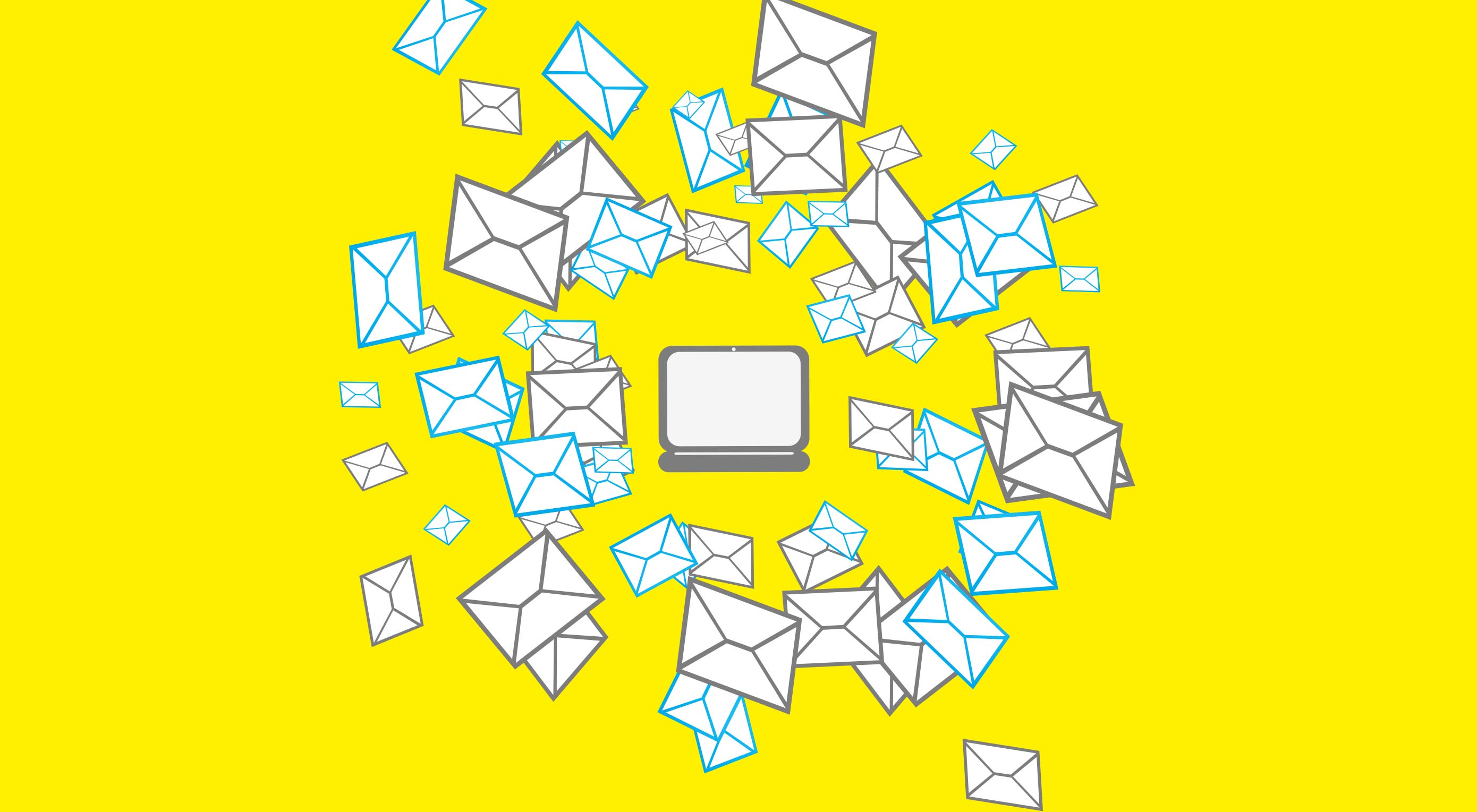
Adobe shared the results of its 3rd annual consumer email survey today, and while some of the findings are extremely predictable—nobody likes spam—others are downright shocking: for example, business email is 36 times more popular than social message services like Slack. Yeah, let that one sink in…

In fact email, that clunky relic of the early days of the web is actually the most popular form of communication online and its popularity is increasing year on year. And not just amongst the more mature, one of email’s biggest user groups, according to Adobe, is millennials.

Should Businesses Use Email?

Businesses should be using any marketing channel that reaches their target demographic, and with email usage increased across the board according to Adobe’s study, every target demographic uses email.

0% check their email on a smartwatch

Drilling down into the results, smartphones are the most popular way of checking email, with 81% of us doing it regularly. However, when it comes to work email, 62% stick to a laptop or desktop. Tablets continue to slide, with only 6% of personal email and 4% of work email checked on them. Of the people Adobe surveyed, 0% check their email on a smartwatch.

So the choice is clear: if you’re marketing to customers in their personal time focus on mobile-friendly design, for business customers laptops and desktops give you more design freedom.

Designing Good Email

Some of the most interesting findings in the Adobe survey relate to the type of email that marketers send to customers.

Of no surprise to anybody in Adobe’s survey is the fact that 40% of emails are deleted without being read. What will reassure you is that among B2C consumers the preference for being contacted by email (as opposed to SMS, or post, for example) is increasing year on year.

61% of consumers say that email is their first choice when being contacted by brands, but almost everyone says that too many brands focus on promotions, when what they really want to receive is quality, information-driven content.

26% of respondents stated that they did not believe that “Inbox Zero” was possible

On average 82% of work emails are opened, compared to 60% of personal emails.

By far the most complained about element of email communication is frequency. Daily emails are seen as too pushy. Emails that don’t match the recipient’s interests, were also singled out for criticism.

Regardless of age group or gender, personalised email was considered desirable and a major factor in not clicking the ‘Unsubscribe’ link.

The UX of Email

According to Bridgette Darling, Adobe’s Product Marketing Manager and expert on email, one of the key trends highlighted by Adobe’s survey is that we are all developing a healthier relationship with email.

Users tend to check email every few hours, but we’re getting better at ring-fencing the times when email is appropriate. That’s partly due to improved email applications, with improved spam filtering, but it’s also a shift in attitude. If you’re reaching out to customers then email is increasingly a positive and productive way to do it.

Users report checking email on average 5.4 hours per working day, reduced from 7 hours per working day last year.

Millennials treat “Inbox Zero” as a goal to be achieved, making their inboxes neat, organised, and checked regularly. Despite this, only half of respondents reported ever reaching “Inbox Zero”. 26% of respondents stated that they did not believe that “Inbox Zero” was possible.

Users over 34 are also developing better habits, restricting the times that they check email. Fewer people are checking work email outside of standard office hours.

Fewer respondents than last year said they were checking their email in bed, although the younger you are, the more likely you are to be scanning your inbox while in your pyjamas.

For respondents under 25, personal email caused more anxiety than work email

Interestingly women check their email marginally more often, but feel that they don’t check enough. Men feel that they check too often.

Terrifyingly 28% of under-25s admit to checking email while driving!

When receiving email, most users over 35 said they felt indifference. For respondents under 25, personal email caused more anxiety than work email.

Email Beats Slack

The big story in online messaging in the last few years is the growth of tools like Slack. These tools do seem to be liked by close working teams, such as developers. However the popularity of such tools is greatly over-estimated.

In 2016, Slack and similar tools had a 2% share of business communications, this year that dropped to 1%. 80% of respondents said they use email in a  professional capacity, compared with just 18% who use video conferencing.

The Future of Email Design

Adobe announced Experience Cloud back in March. It’s a suite of marketing tools designed to use the power of Adobe’s Sensei AI technology to deliver improved customer experiences.

Adobe Marketing Cloud, and Adobe Analytics Cloud, which both form part of Adobe Experience Cloud, integrate with Adobe Creative Cloud—it’s amazing they ever see the Sun over in San Jose—meaning web designers can utilise existing skills to design enterprise level email campaigns.

Adobe is working on predictive images for email with Ignite, a system for scoring images based on how frequently emails are opened, read, acted upon, and more. Just as subject lines can be scored, soon image scores will allow us to send email finely tuned to appeal to different demographics.

In future, we’ll also see multi-lingual campaigns via Experience Cloud, so that companies that sell in multiple languages can co-ordinate their campaigns more easily.

It is far cheaper for businesses to hold on to existing customers than it is to attract new ones. The personalised nature of email means that once we’ve established a relationship, it’s relatively simple to maintain that customer relationship with intelligent email design.

Many people have predicted that email will fall away as messaging services take over, but it seems that at least for now, that simply is not the case. Email continues to be the way most customers prefer to be contacted, and is the best way to build a loyal customer base.

168 Social Media Templates for Facebook, Instagram, Twitter & Pinterest – only $24!

Source

from Webdesigner Depot https://www.webdesignerdepot.com/2017/08/adobe-reveals-the-secrets-of-email/

5 Ways the Floating Action Button Boosts UX

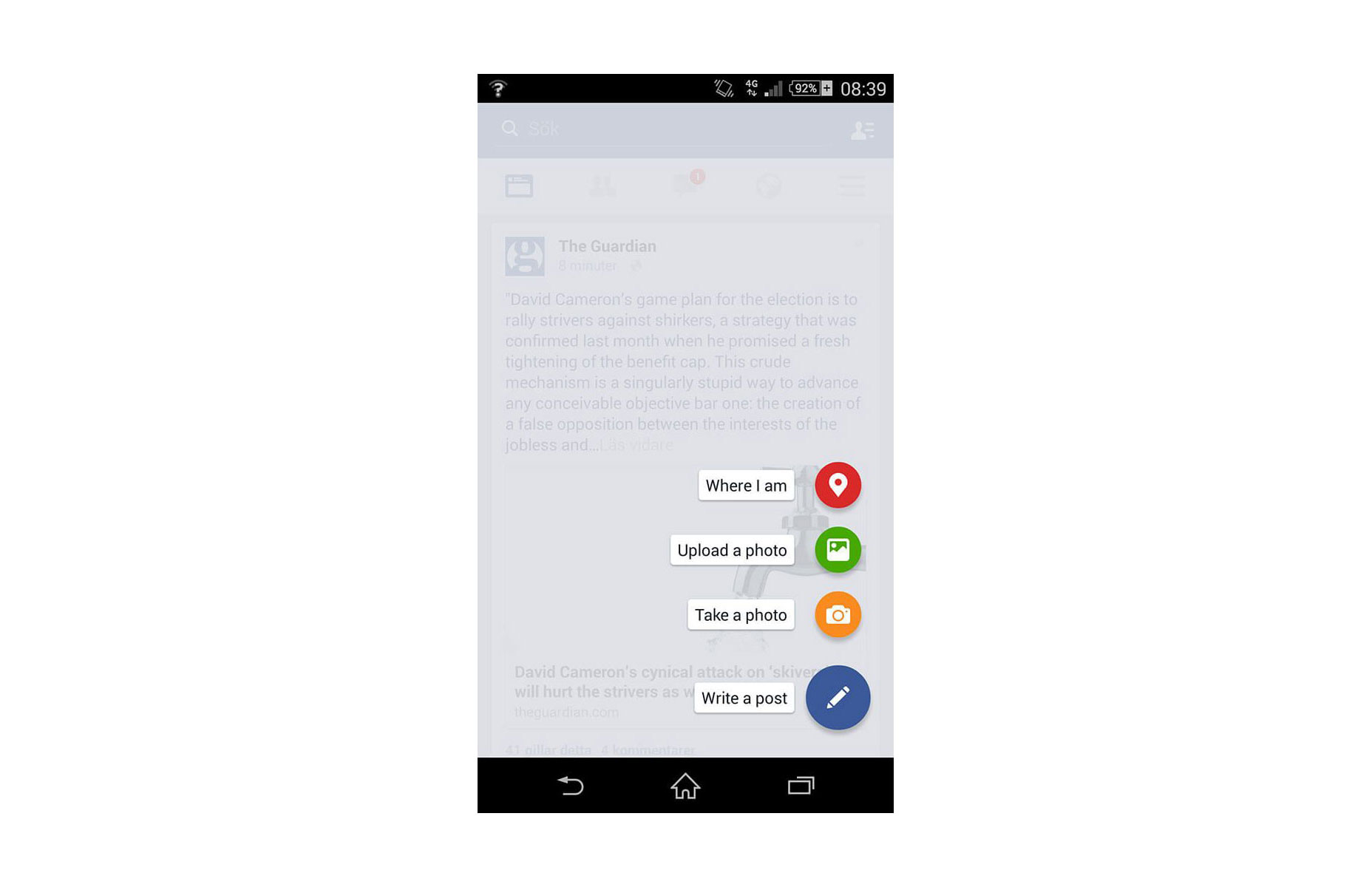
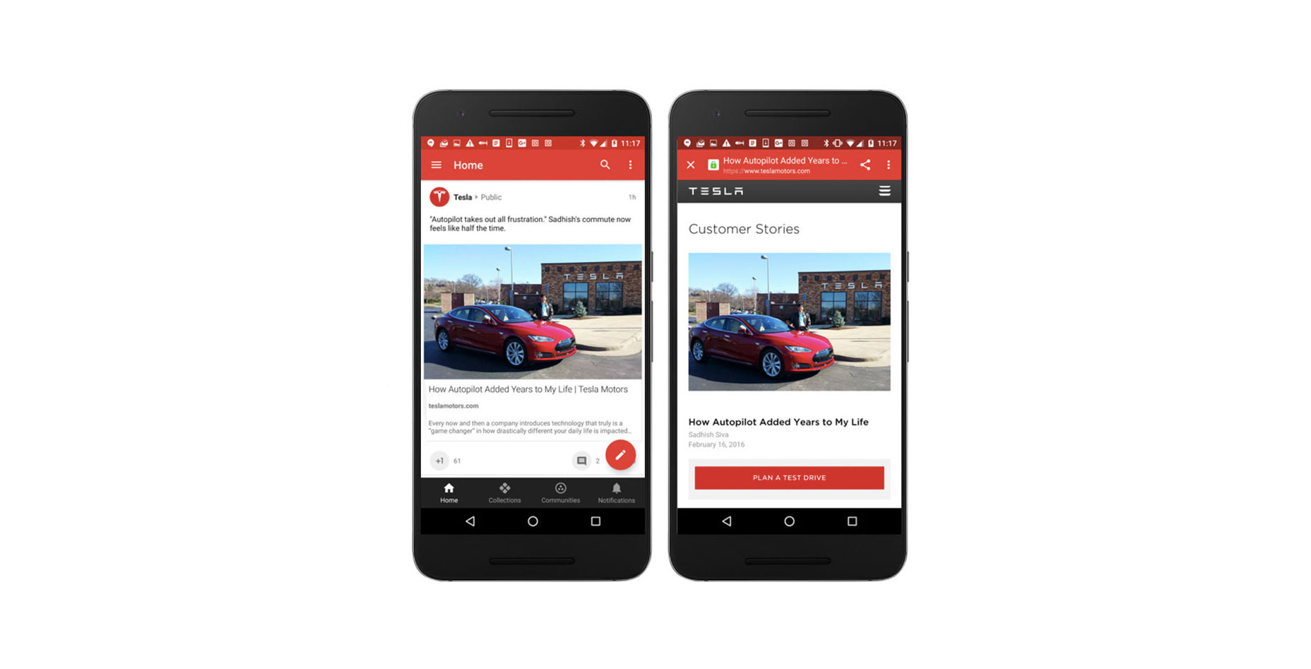
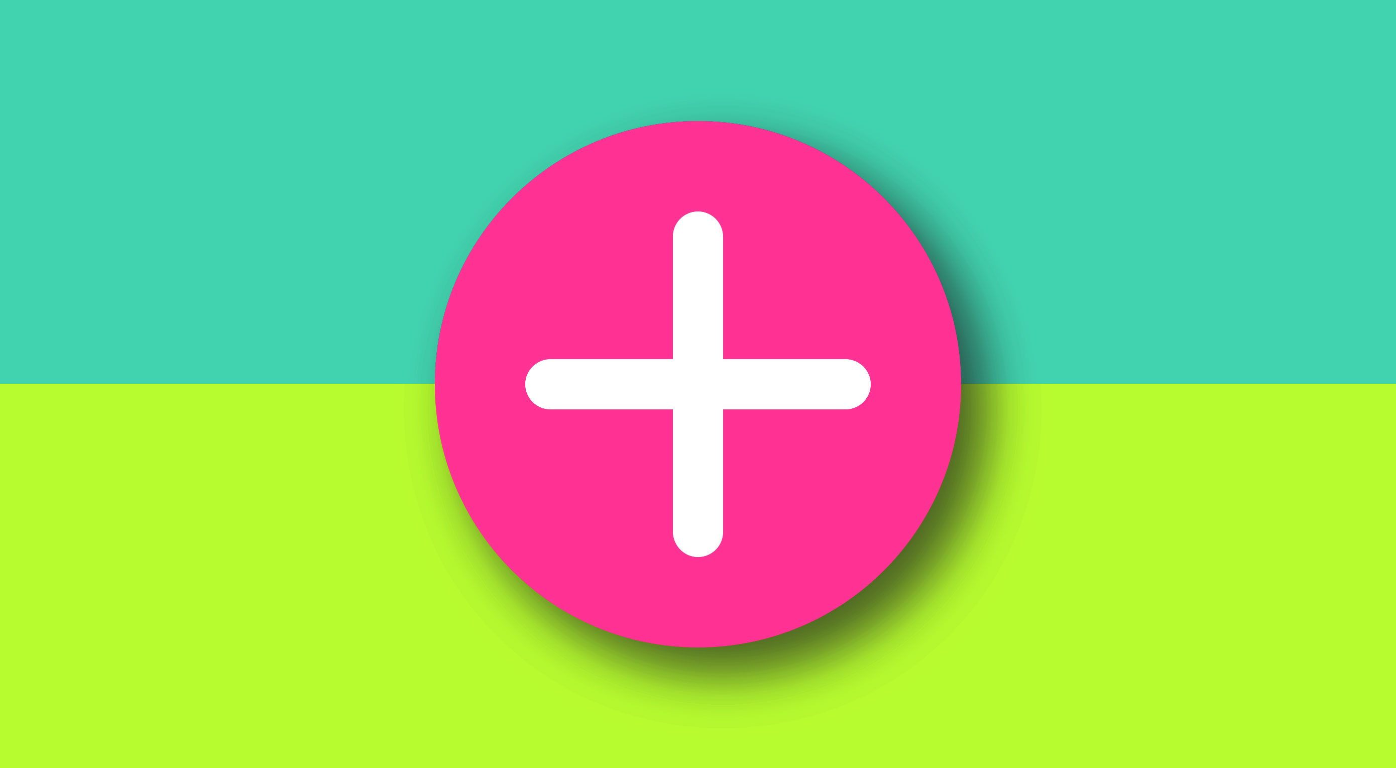
A Floating Action Button (FAB) is a circled icon floating above the user interface. Its shape, position, and color ensure it stands out from the rest of a UI. FAB was popularized by the release of Google’s Material Design principles in 2014. Since this release, the FAB user interface element has been widely adopted in web and mobile design.

Although the FAB may be seen as a small, seemly insignificant UI component, its effects can be important. Given that the pattern is used correctly, it’s meant to be instantly identifiable and accessible.

Floating Action Button in Android app

1. Represent a Hallmark Action

Ideally, FAB should highlight the most relevant or frequently used actions, it should be used for the actions that are the primary characteristics of your app. If you’re going to use FAB in your app, the design of the app must be carefully considered and the user’s possible actions must be boiled down to a single prominent feature. For example, a music app may have FAB that represents ‘Play/Stop’. An Instagram-like app might have a FAB that represents ‘Take a Photo’.

A floating action button represents the primary action in an application. Pausing or resuming playback on this screen tells users that it’s a music app.

According to research by Steve Jones, FAB demonstrates a slight negative usability impact when users first use the button. However, once users successfully complete a task using the FAB, they are able to use it more efficiently than a traditional action button.

2. Be a Way-Finding Tool

FAB is a natural cue for telling users what to do next. Research by Google shows that, when faced with unfamiliar screens many users rely on FAB to navigate. Thus, FAB is very useful as a signpost of what to do next.

The use of a Floating Action Button in Twitter encourages you to post content

3. Provide a Set of Actions

In some cases, it is appropriate for the button to spin out and expose a few other options as can be seen in the Evernote example below. The FAB can replace itself with a sequence of more specific actions and you can design them to be contextual to your users. As a rule of thumb, provide at least three options upon press but not more than six (including the original floating action button target).

Also keep in mind that these actions must be related to the primary action the FAB itself expresses, and be related to each other: do not treat these revealed actions as independent as they could be if positioned on a toolbar.

Don’t: ‘Where I am’ action isn’t relevant to create content actions.

4. Be Context Aware

Context plays an important role in user interaction. Sometimes users want to consume content, sometimes they want to perform actions. It all depends on context. Using some contextual behavior could bring the best of FAB to the UX of any app. Let’s consider Google+ as an example. Google+ shows the button when the user is engaging with the stream, and hiding it when that engagement is reversed. These two states rely on context : when users are engaging with a social stream, a primary action is to scroll, hence there’s no need for FAB, and when users stop scrolling, they might want to post something.

5. Connect Two States Together

FAB is not just a round button, it has some transformative properties that you can use to help ease your users from screen to screen. When morphing the floating action button, make transition between two states in a logical way. The animation in the examples below maintain the user’s sense of orientation and help the user comprehend the change that has just happened in the view’s layout, what has triggered the change, and how to initiate the change again later on if needed.

Image credit: Ehsan Rahimi

Image credit: Dribbble

Conclusion

Some might say that FAB is bad UX. It’s tempting to say that because users and designers aren’t used to it. We are used to familiar toolbars and the concept of FAB is still fairly new to us. We all know how that new things are hard, but at the same time they encourage a more carefully designed user experience. Used correctly, FAB can be an astoundingly helpful pattern for the end-user.  

168 Social Media Templates for Facebook, Instagram, Twitter & Pinterest – only $24!

Source

from Webdesigner Depot https://www.webdesignerdepot.com/2017/08/5-ways-the-floating-action-button-boosts-ux/

Monday 28 August 2017

Essential Design Trends, September 2017

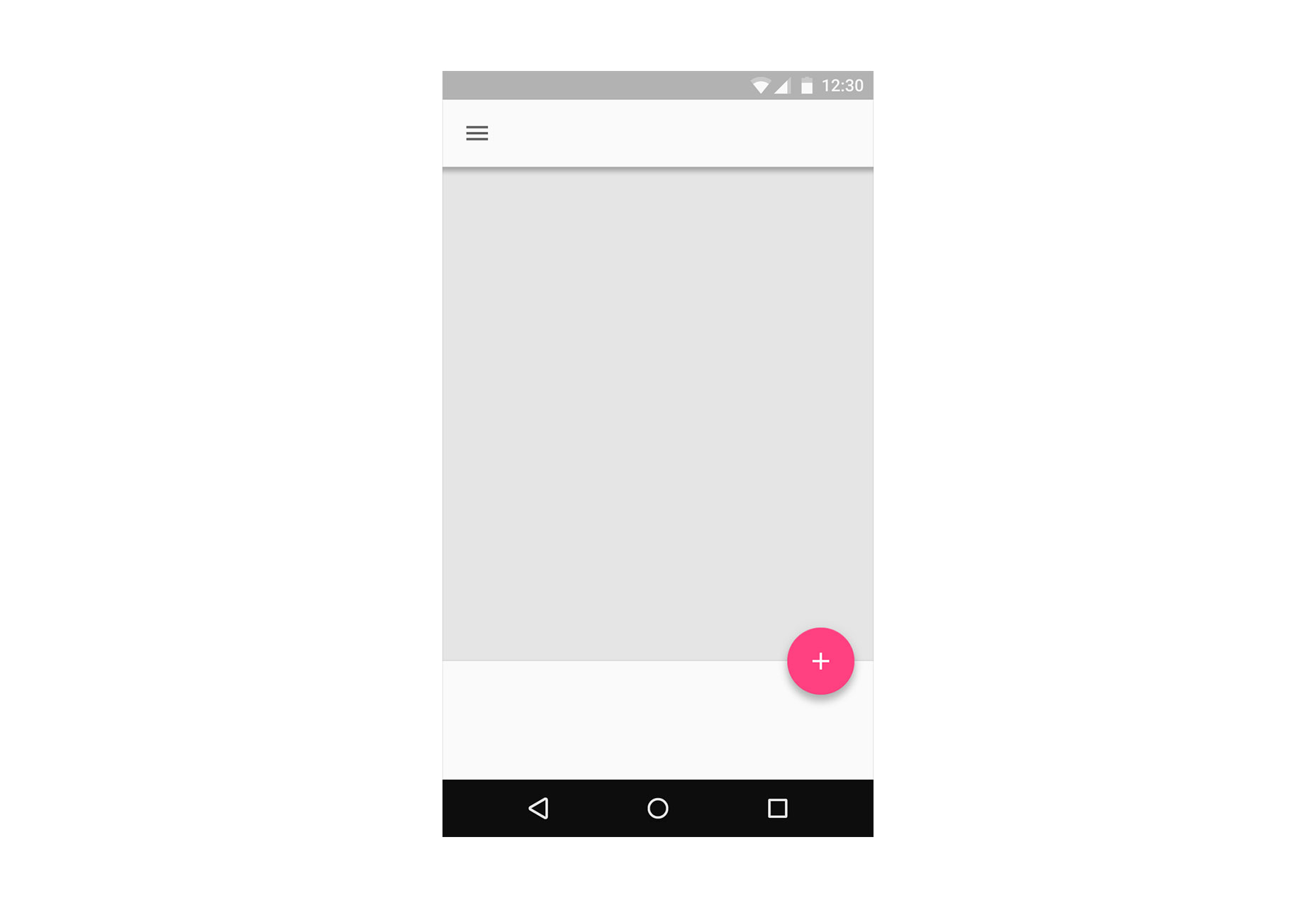
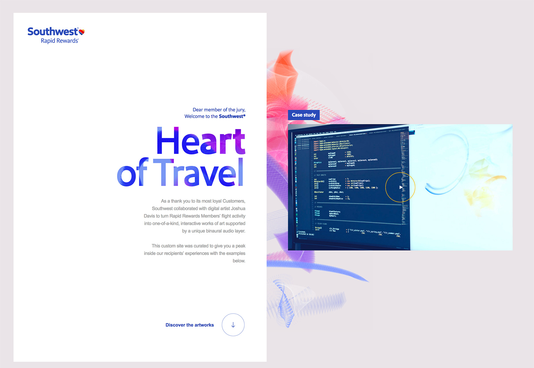
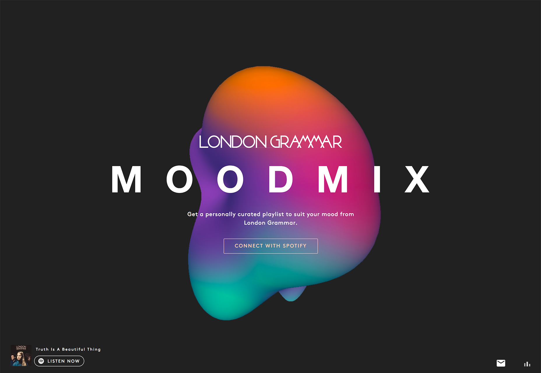
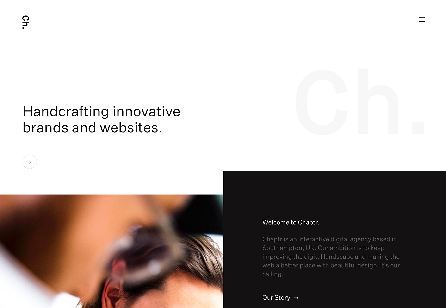
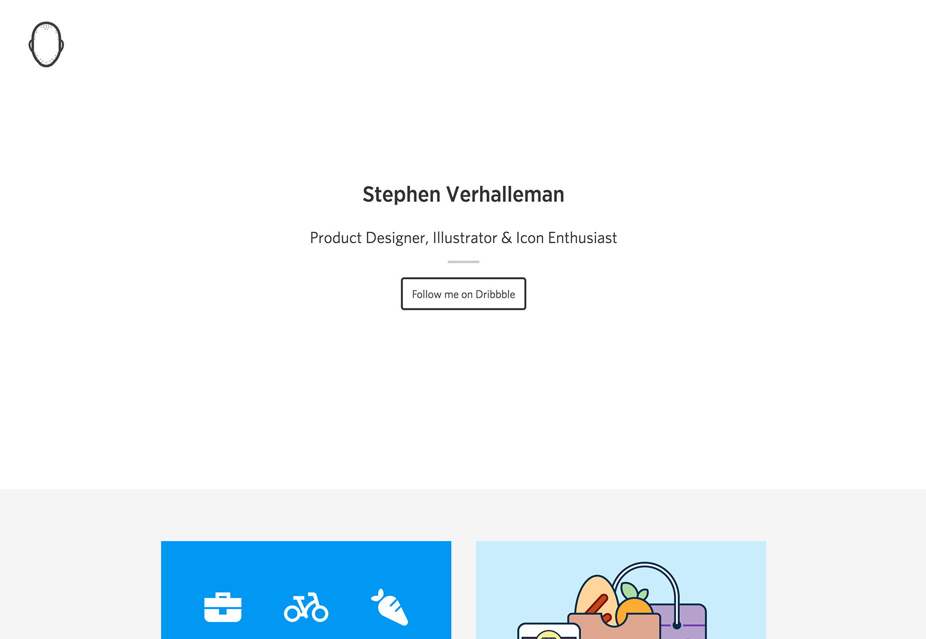
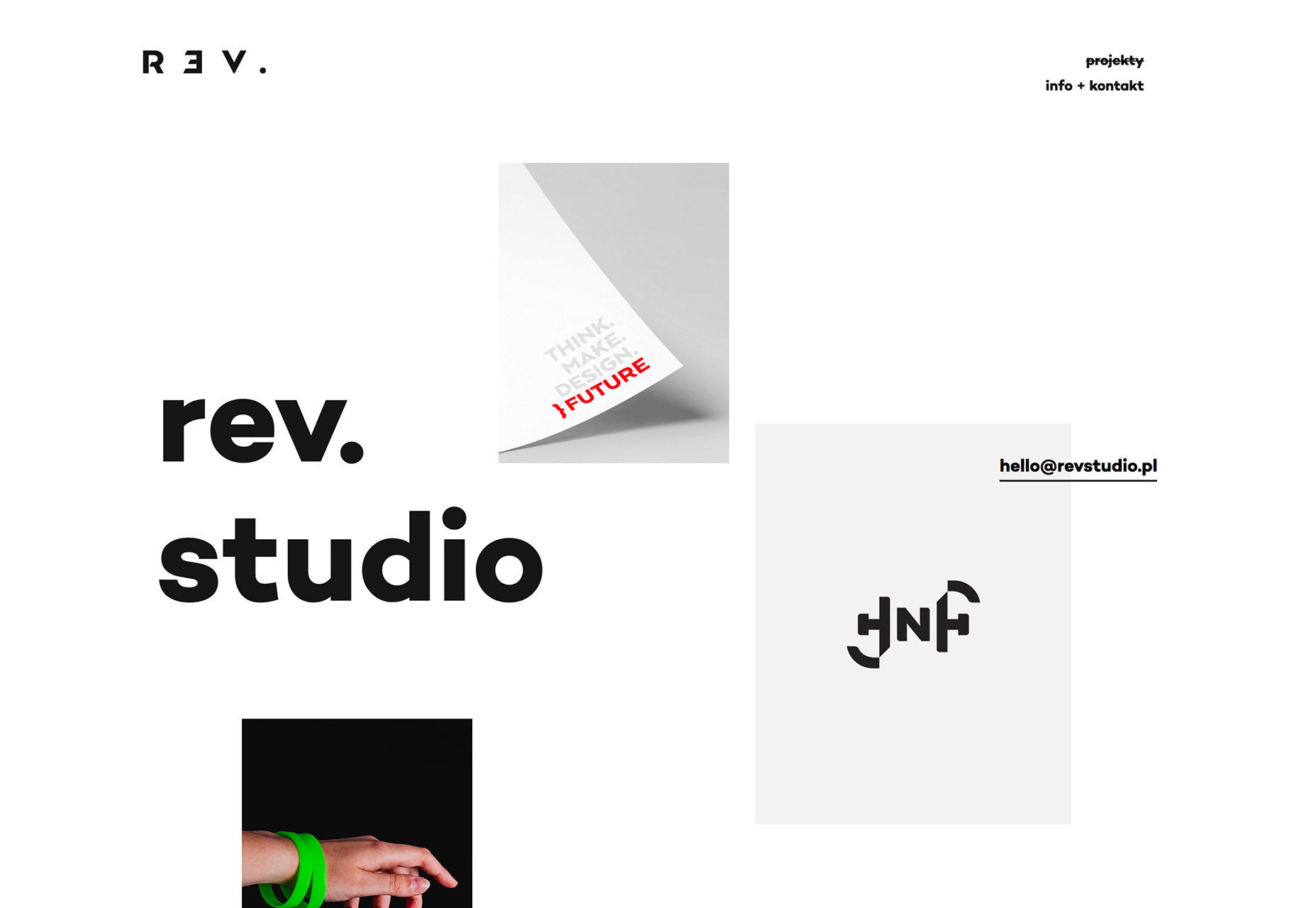
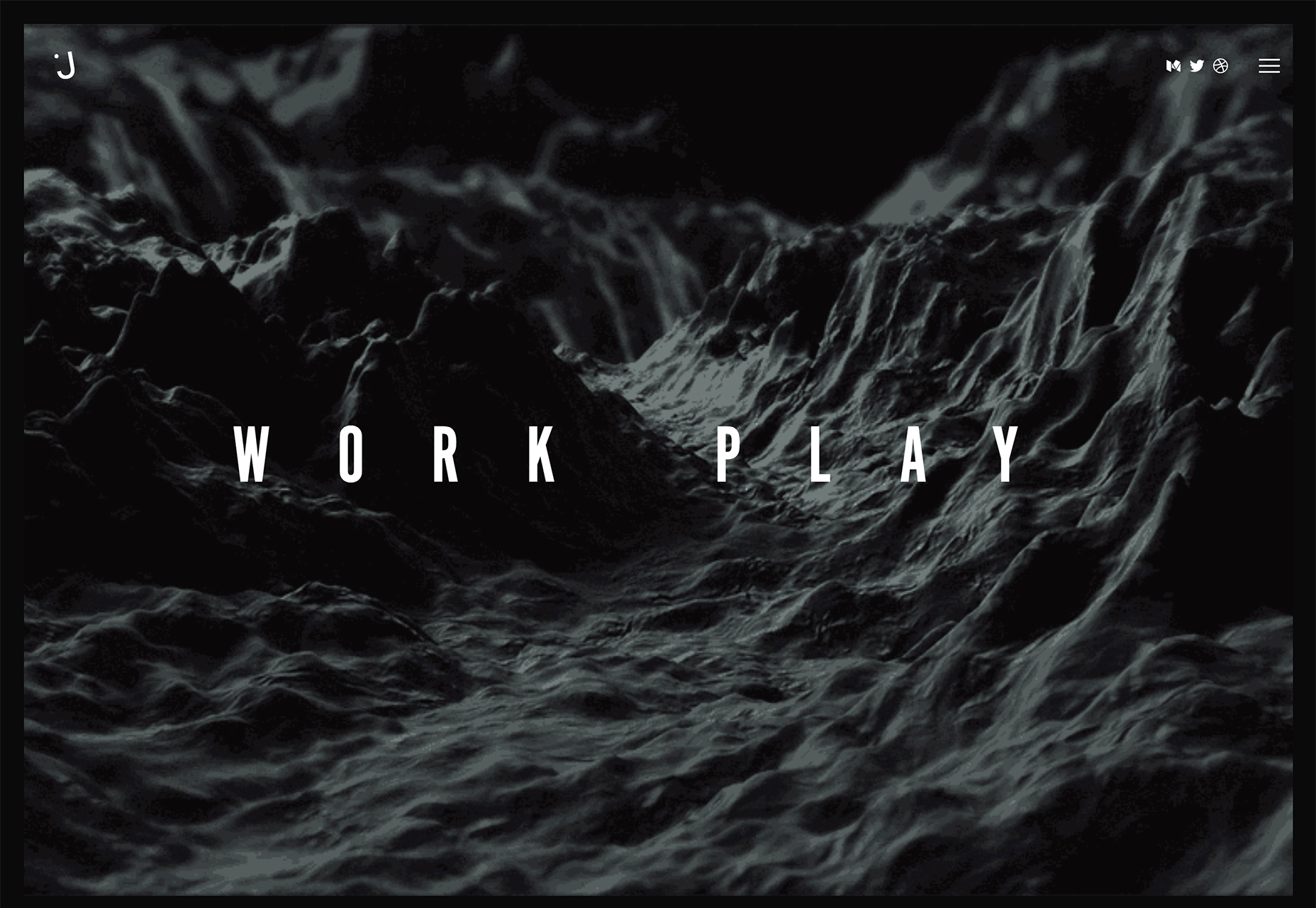
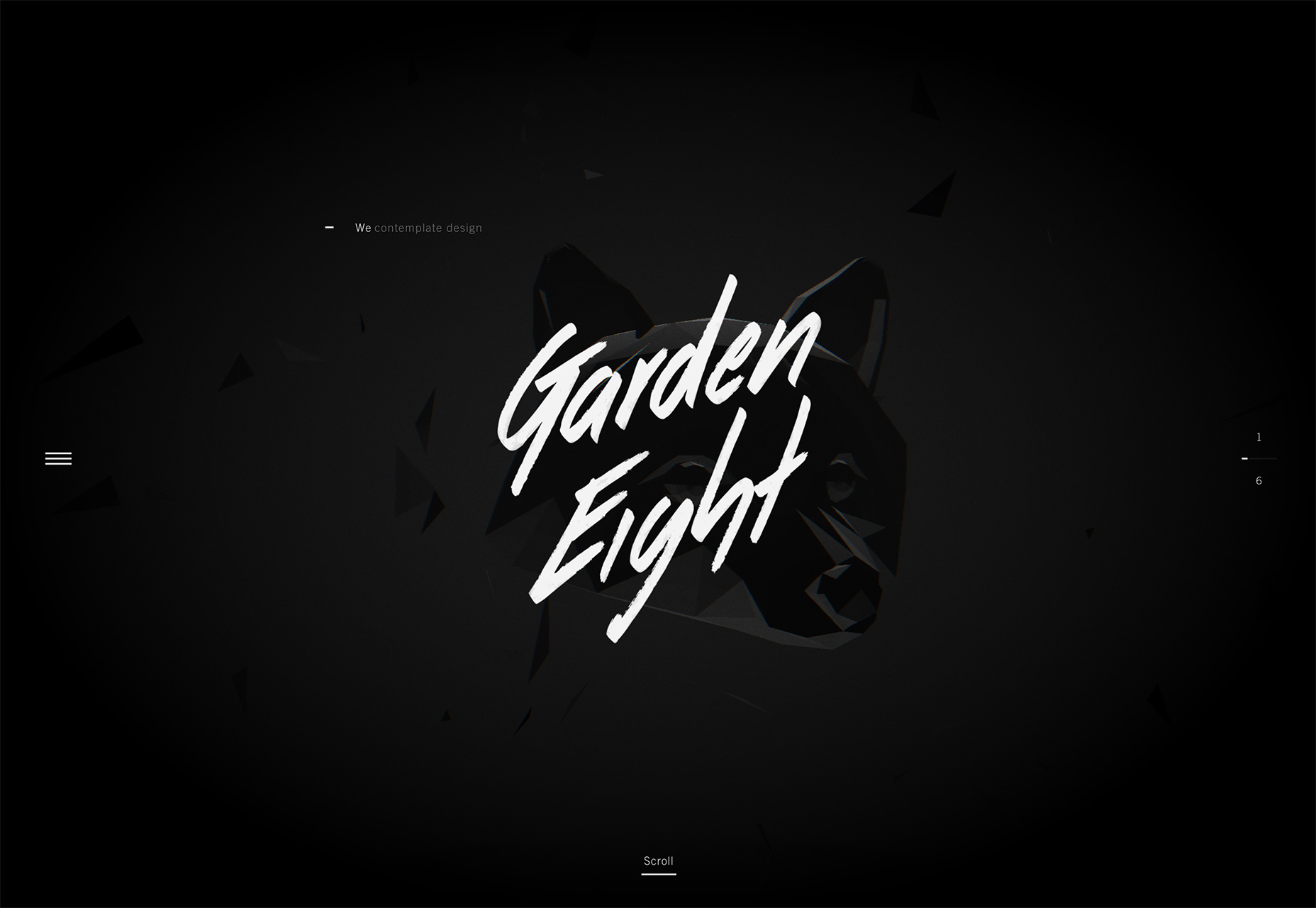
Sometimes you can just look at new website projects and see what designers are thinking. You can feel the mood. This month’s trends reflect that concept with bold color choices, a collapse of the traditional hero header style that’s been popular for a while and dark animated patterns that are just a bit mysterious.

What do you think? Are you ready for thinner typography options, more elaborate detailing and icon-style logos? You might be after seeing some of these design projects.

Here’s what’s trending in design this month:

1. Rainbow Colors

When you hear “rainbow colors,” the first thing that comes to mind is probably not good design. There are too many glaring examples of garish projects with rainbow-themed color palettes that are overwhelming and, quite frankly, design disasters.

Today’s rainbow colors are anything but disastrous. They are classy, simple and provide just the right amount of color to a surprising number of projects. Rainbow palettes aren’t just for small websites either; big brands including the Github Universe Conference, Southwest Airlines and London Grammar’s Spotify channel all use interesting rainbow patterns.

Even more interesting is that every design uses the same color concept in very different ways.

  • Rainbow text elements in a dark aesthetic: Github uses a simple dark aesthetic with rainbow colored text and user interface elements to draw the eye from key information (such as the date) to the main call to action (ticket sales). The rainbow gradient is simple and subtle, while setting mood of opportunity and optimism. This seems like just the right combination to encourage users to register for a conference.
  • Southwest Airlines takes another approach with rainbow background elements and text fill in a lighter container element. The rainbow accent provides a visual reference point for a site that has content that could be construed as boring. Color gives the case study a little more life to help encourage clicks.
  • London Grammar uses a giant rainbow orb to draw users into the sound-mixing experience collaboration with Spotify. The rainbow blob shifts and moves with a slow animation that feels like gel in water. The colors move and merge and it is something you could look at all day if you aren’t careful. The gamification aspect of the colored element is also interesting, but the color is definitely what draws users in first.

2. Collapse of the Hero Header

The oversized photo or slider hero header has been a website design staple for years. But there’s a trend to get away from the pattern with more designers opting for a more minimal above the scroll structure with more elements and a less constructed feel.

The result seems to be a trend with more white or light headers that have a smattering of parts floating around. This trend gets somewhat mixed reviews. Some of the visuals are interesting, but overall there seems to be an overall lack of focal point for users and clearly defined set of actions to take.

What’s nice about the collapse of the hero header is that the minimal approach makes users look. It is different. The question is whether there is enough messaging to carry their interest for long or if users will respond positively to a less visual website experience.

This is a trend to watch, because it is likely in the early stages of evolution. Designers are ready to do something different with the tops of pages (and understandably so). This iteration of projects is just the first step toward something new. Some designers might be perturbed by the odd combination or parts of elements above the scroll in most of these design concepts so far. It remains to be seen where the trend goes next, but it is worth keeping an eye on for sure.

3. Dark Animated Patterns

This might be the most fun trend in website design right now: Dark animated effects layered on top of dark color schemes. The dark on dark concept is mysterious, visually interesting and really makes the user look and engage with the design.

Plus, it can work in so many different ways. There’s no set to the size or type of animation or what the effect does. Each of the examples below use dark animated effects in different ways that all encourage some sort of interaction from automated movement to mouse over effects to flashes of surprise (you’ll have to click the links to find that one).

While these design look really cool, they can pose some challenges as well. Not all users are keen on such a dark aesthetic. It might not render well in all environmental conditions. These designs definitely look and function better on desktop screens than smaller devices.

But the design trend does have a place for designers that want to create something a little different, with a certain mood and trendy aspect.

There’s also something about combinations of dark hues without a lot of color that just draws you in. (It’s kind of unexplainable.)

To make the most of the dark on dark trend, make sure to use enough variance in dark hues to make sure elements can be seen and that movements are discernable. Use rich blacks with plenty of undertones to set the right mood for each project.

While the examples below all completely lack color, consider a contrasting hue other than white for key points of emphasis. (A colored call to action button would really stand out with the amount of contrast all the black imagery provides.)

The other commonality with this trend is in the simplicity of the animations used. None of the movement is overly complex. It is as simple and streamlined as the color palette, which is a key contributor to the overall success of the design trend.

Conclusion

The shift in color usage showcased by this month’s trends is both interesting and effective. Rainbow colors are a lot of fun and uplifting while minimal white and dark patterns both provide plenty of room for introspection and reflection. Color choices really do connect to how designers feel about a project.

What trends are you loving (or hating) right now? I’d love to see some of the websites that you are fascinated with. Drop me a link on Twitter; I’d love to hear from you.

50 Professional PowerPoint & Keynote Presentation Templates – only $17!

Source

from Webdesigner Depot https://www.webdesignerdepot.com/2017/08/essential-design-trends-september-2017/

Sunday 27 August 2017

Popular Design News of the Week: August 21, 2017 – August 27, 2017

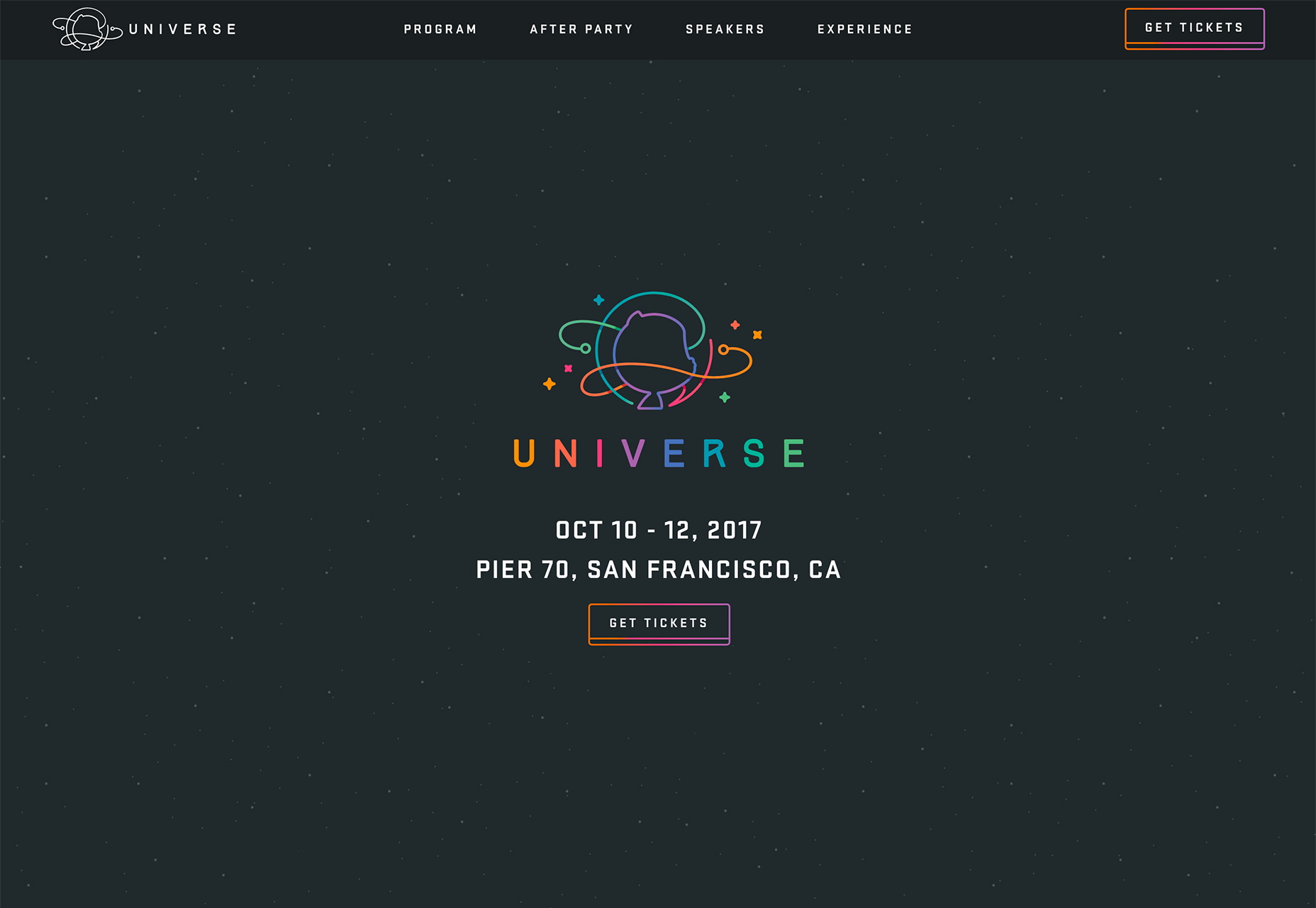
Every week users submit a lot of interesting stuff on our sister site Webdesigner News, highlighting great content from around the web that can be of interest to web designers. 

The best way to keep track of all the great stories and news being posted is simply to check out the Webdesigner News site, however, in case you missed some here’s a quick and useful compilation of the most popular designer news that we curated from the past week.

Note that this is only a very small selection of the links that were posted, so don’t miss out and subscribe to our newsletter and follow the site daily for all the news.

5 Amazing Hamburger Menu Trends to Emulate


12 Extensions that will Make any UX Designer’s Life Easier


Google Drops Support for HTTP on Chrome


Preact : A Smaller, Faster React Alternative


Simplicity in UX Design


Coming Soon Page Design: How to Make it Awesome and Successful


Pastel Colored Ocean in CSS (a Calm Place to Slow Down)


JavaScript is Eating the World


Skeuomorphism, Flat Design and the Rise of Type Design


Medium’s New Logo: A Review


19 Slack Groups for Designers & Developers


Facebook Design’s Desktop Kit


Studio Vs Freelance: The Pros and Cons


Visura – Think Linkedin Combined with Squarespace for Creatives


Don’t Overthink. Just Do.


If Celebrities were Pantone Colours


30 Useful User Onboarding Tools


The Grid (the Much-hyped AI Website Builder) is Near Industry-low in Customer Satisfaction


What Happens to Creativity as We Age?


“Dark UX” Design is Everywhere Online and It’s Turning You into a Sleep-deprived Internet Addict


Four Psychology Principles Every UX Designer Should Know


Interface Font Family


Why Blockchain Needs Design


#WeStandTogether


Branding the Moon: Play Among the Stars


Want more? No problem! Keep track of top design news from around the web with Webdesigner News.

LAST DAY: 10 Modern, Hand Drawn Calligraphy Script Fonts – only $24!

Source

from Webdesigner Depot https://www.webdesignerdepot.com/2017/08/popular-design-news-of-the-week-august-21-2017-august-27-2017/