 As you draw closer to the finish line with a website, does your client see it just as clearly as you do? Or are they still wavering on design and copy choices even while you’re in the final stages of QA, or talking about additional features they’ll want to add to the site “some day”?
Unless you are getting paid — and paid well — for every single hour you put into a website, you have to be willing to enforce a final stopping point. If you don’t, your client will undoubtedly play the “What about this? Or this?” game for as long as you allow them to.
And you can’t afford to do that. You have other clients whose websites deserve your attention.
Just as you have created an onboarding process to smoothly kick off a new website project, you must do the same with an offboarding process.
Step 1: Collect Your Final Payment
Once the client has given you the approval on the finished website, you push it live. After some light testing to confirm that all is well on the live domain, it’s time to initiate the offboarding process.
You’ll do this by sending along the last invoice. Better yet, your invoicing software should automatically be configured to do this upon reaching the final project milestone.
My favorite tool to do this with is AND CO.
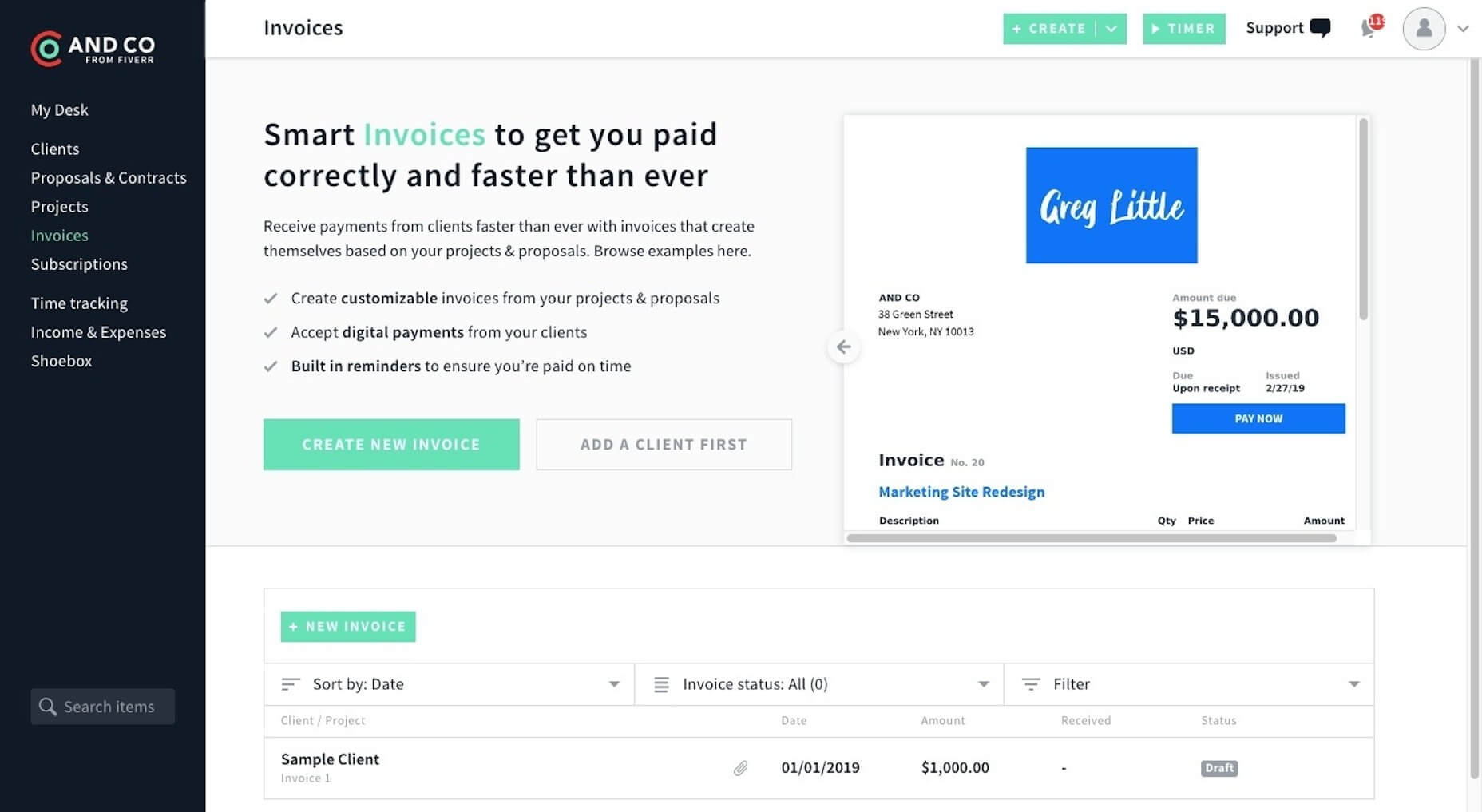
That’s because you can do everything in here:
- Create a proposal;
- Send the contract;
- Track your time;
- Send invoices.
Because each of these elements exist within the same place, setting up and scheduling invoices based on your project’s milestones (including the launch date) is really easy to do.
Don’t move on to the next steps until you collect the payment due though. Letting a client go any more than seven days after the project’s end without final payment simply invites them to ask you to do more work.
Step 2: Send the Wrap-up Email
Upon confirming receipt of payment, send your client a wrap-up email.
This doesn’t have to be lengthy. The goal is to get them to schedule the closing call as soon as possible. Something like this should work:
Greetings, [client name]!
I wanted to thank you for the opportunity to build this website for [company name]. I hope you’re just as pleased with it as I am!
I know you’re excited to put this website to work for you now that you have it, but I have just a few things I want to show you as we wrap up.
When you have a moment, please go to my Calendly and schedule a 15-minute Wrap-Up Session for some time this week.
During this call, I’ll give you a behind-the-scenes tour of your website and show you how to edit your content. Afterwards, I will send along the login credentials you need to manage your website along with all of your design assets.
Talk soon.
As I mentioned in the message above, Calendly is the tool I use to simplify my scheduling with clients.
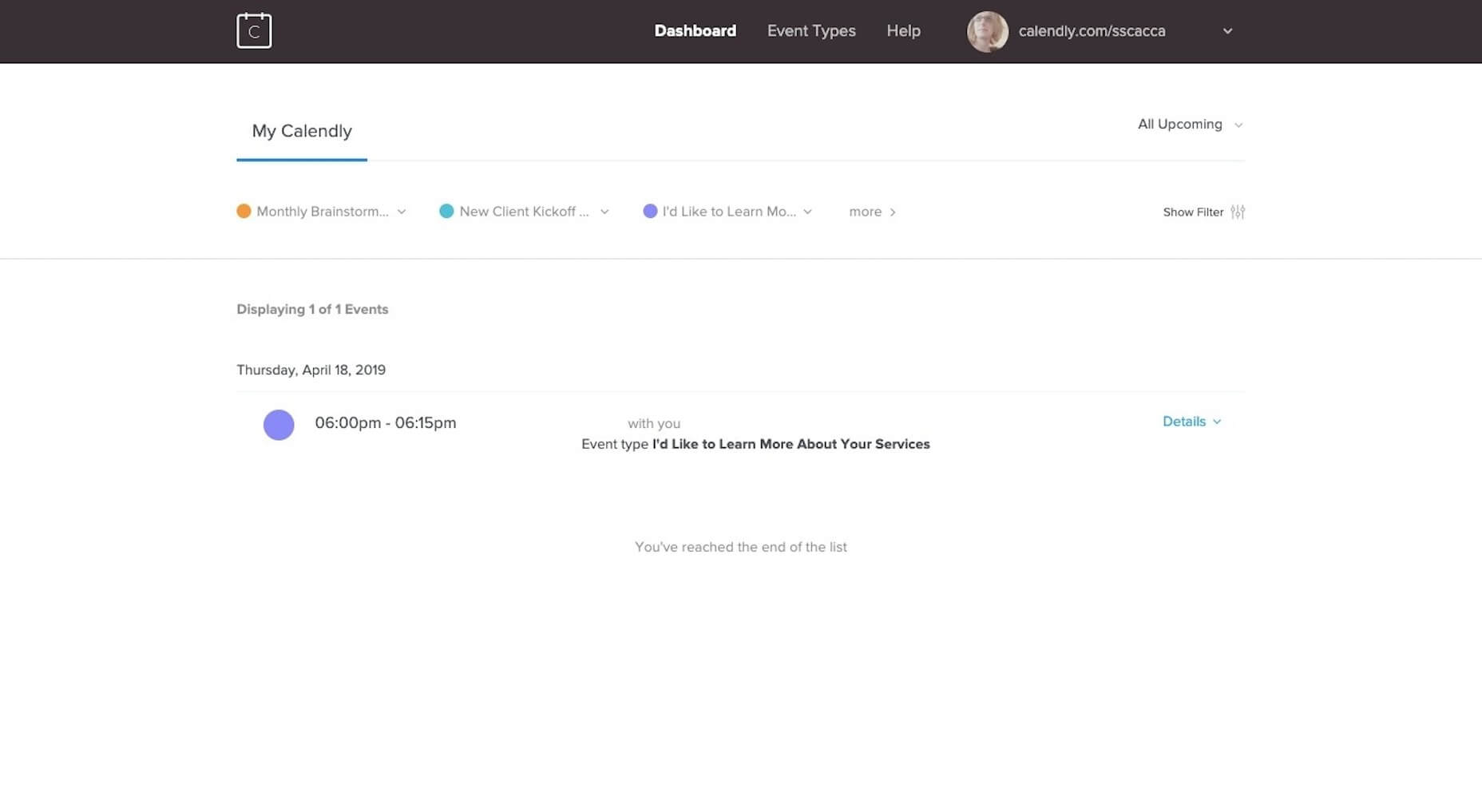
All you have to do is create an event (like “Client Offboarding” or “Client Onboarding”), set up your availability, and then send the link to your clients to pick a time when you’re free. It makes life so much easier.
Step 3: Do the Wrap-Up Video Call
This final call with your client needs to be done over video or, at the very least, a screen-share. For this, I’d suggest using Zoom.
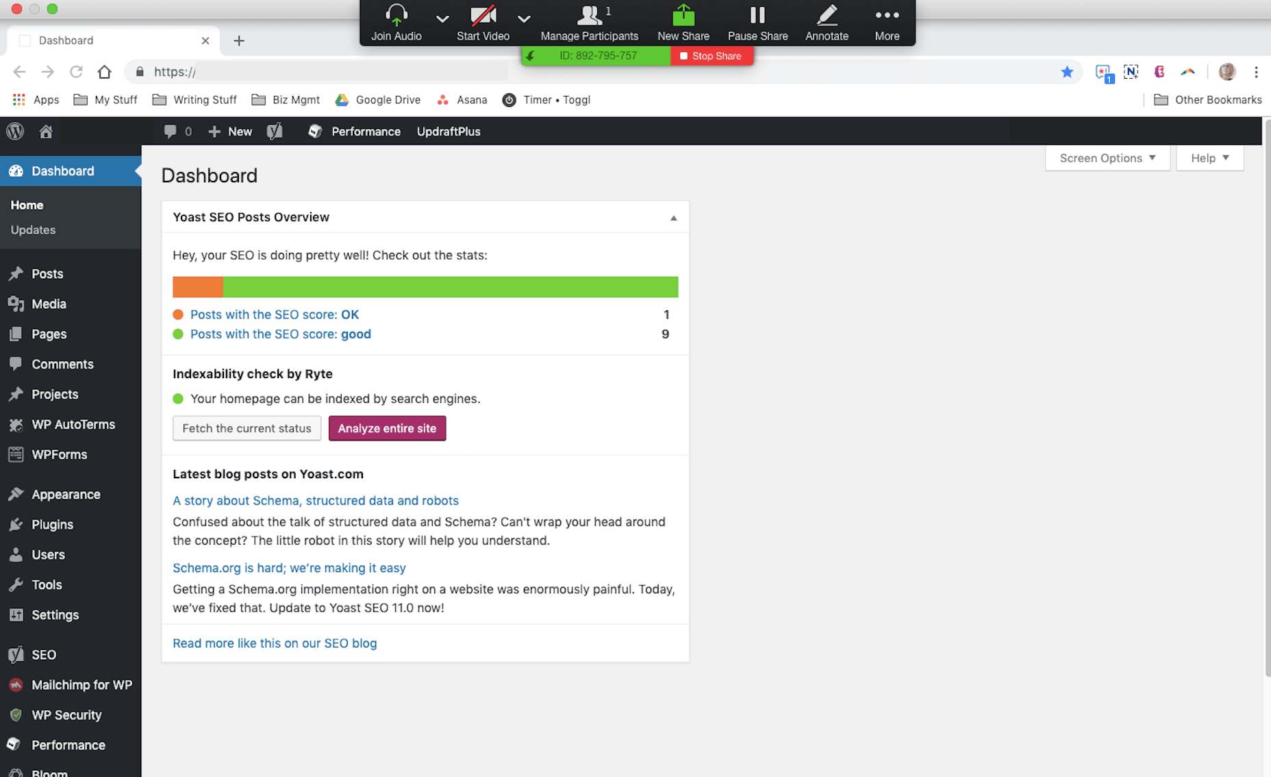
The above example is how I used to do my offboarding calls with WordPress clients.
I’d log into their website and then give them an orientation of all of the key areas they needed to know. I’d show them how to create a post, how to create a page, and explain the difference between the two. I’d also show them important areas like the Media folder, the area to manage Users, and maybe a few other things.
This “training” call is yours to do with as you like. Just make sure the client walks away feeling confident in taking the reins over from you.
Step 4: Deliver the Remaining Pieces
The website is done, you’ve collected the payment, and you’ve had the final call with your client. Now, it’s time to deliver the remaining pieces you owe them.
Logins – If you created any accounts from-scratch (e.g. WordPress, web hosting, social media, etc.), send along the login credentials.
Style guide – Did you create a style guide for the client? Package it up in a professional-looking PDF and send it over in case they decide to work with another designer in the future.
Design assets – Again, on the off chance they work with someone else, you’ll want to send along the design assets you created in their native formats.
Licenses – You may have licensed certain assets during this project, like stock photos or design templates. If that’s the case, you’ll need to bill them for the licenses (if you haven’t already) and transfer ownership to them now.
While you could send these along before the wrap-up call, you run the risk of the clients taking the materials and running away… Only to show up months later wanting to know what all this stuff is, what they’re supposed to do with it, and wondering if you’ll have time to walk them through the website now.
Or they don’t open any of it and then message you months down the line, urgently demanding access to their site, files, etc. To avoid this from happening, clearly label everything and send it along in a shared Dropbox folder.
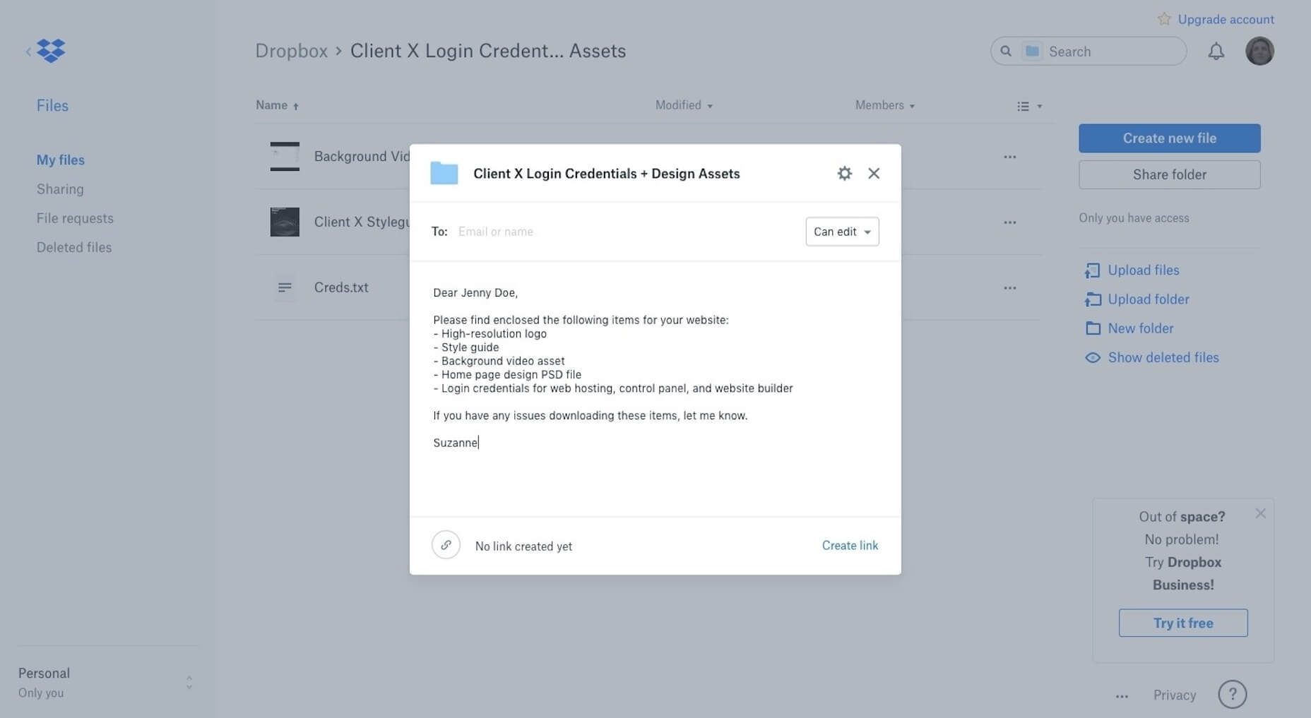
Even if they lose the link to the Dropbox folder at any point, you don’t have to repackage up all their stuff again. You can simply grab the link from your end and resend.
Step 5: Follow Up in 60 Days
Set a reminder in your project management template to follow up with website clients 60 days after the wrap-up. This will give them enough time to sit with the website and either:
- Become really comfortable using it;
- Realize it’s too much work.
Either way, it’s a good idea to check in.
If they’re taking good care of the website and using it to promote their business, that’s great. This email will simply serve as a reminder that you remain their trusted ally and you’re here if they ever need anything.
And if they’re not taking care of it, this is an excellent opportunity to offer your assistance in providing (paid) support and maintenance.
Bringing Projects to a Close with an Offboarding Process
If you’ve done a good job of setting expectations with your client from the start, bringing a project to a close should be no problem.
Then again, you know how clients can get. They’re so excited to actually have a website now that they can’t stop imagining the possibilities. So long as you’ve delivered what they paid for, though, you are under no obligation to keep this project open to entertain those ideas unless they start a new contract with you.
Use this offboarding checklist to ensure you give each of your web design projects as strong and final a close as possible.
Featured image via Unsplash.
| Add Realistic Chalk and Sketch Lettering Effects with Sketch’it – only $5! |
from Webdesigner Depot https://www.webdesignerdepot.com/2019/04/5-steps-for-successfully-offboarding-web-design-projects/
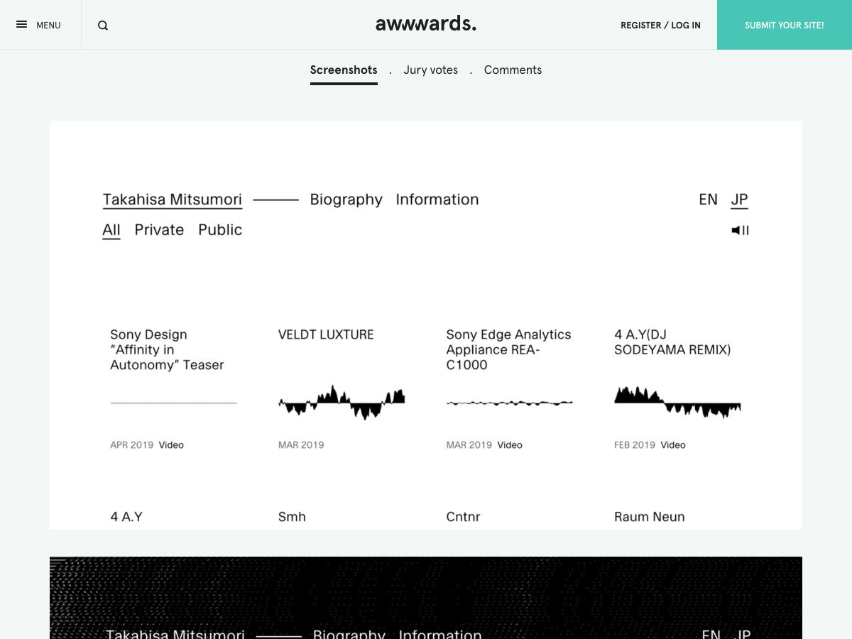
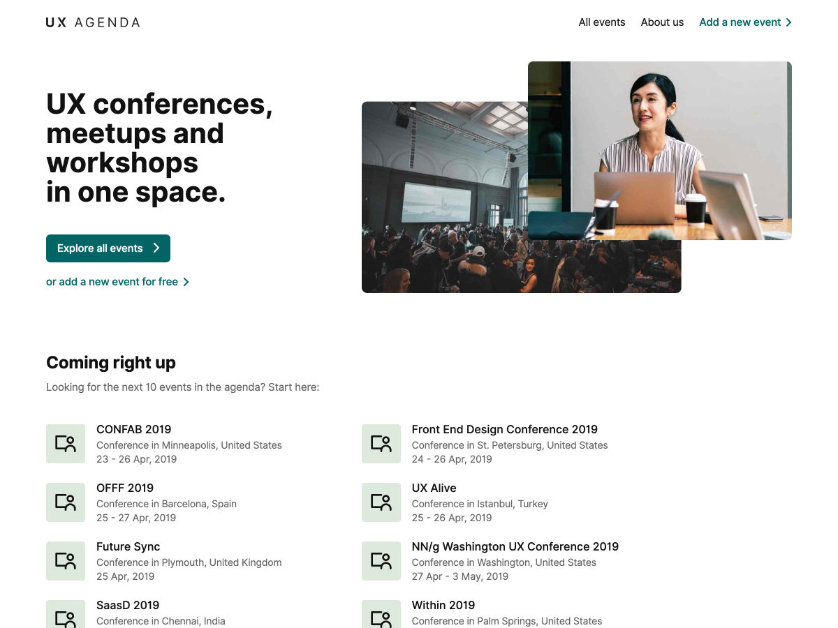
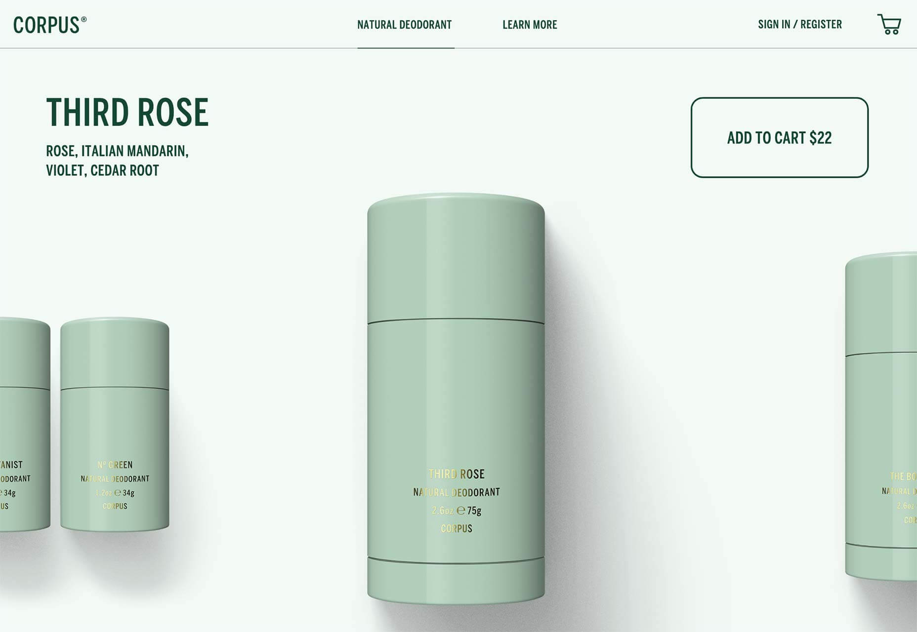
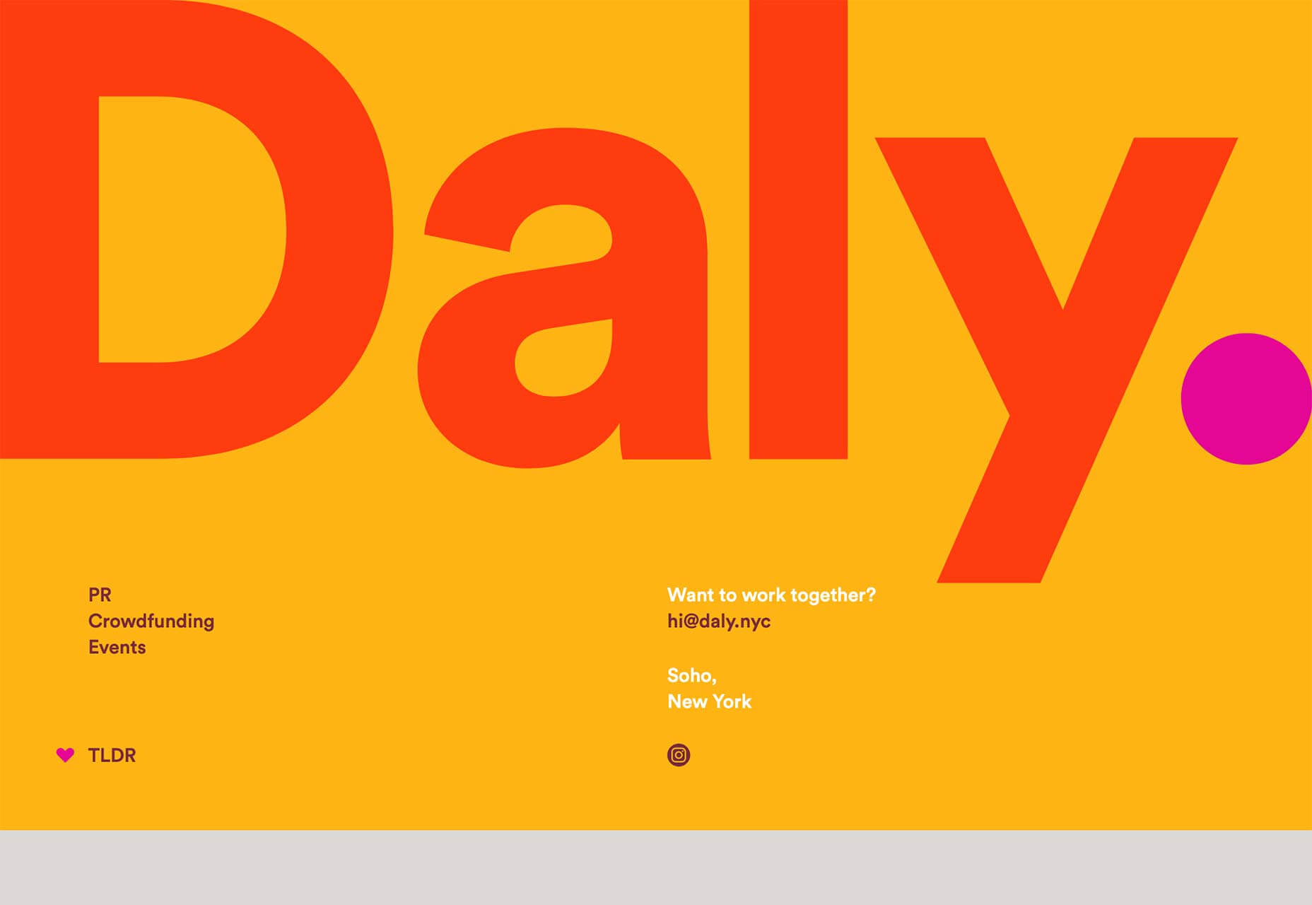
 Welcome to our roundup of the best new sites to be launched (or relaunched with significant updates) in the last four weeks.
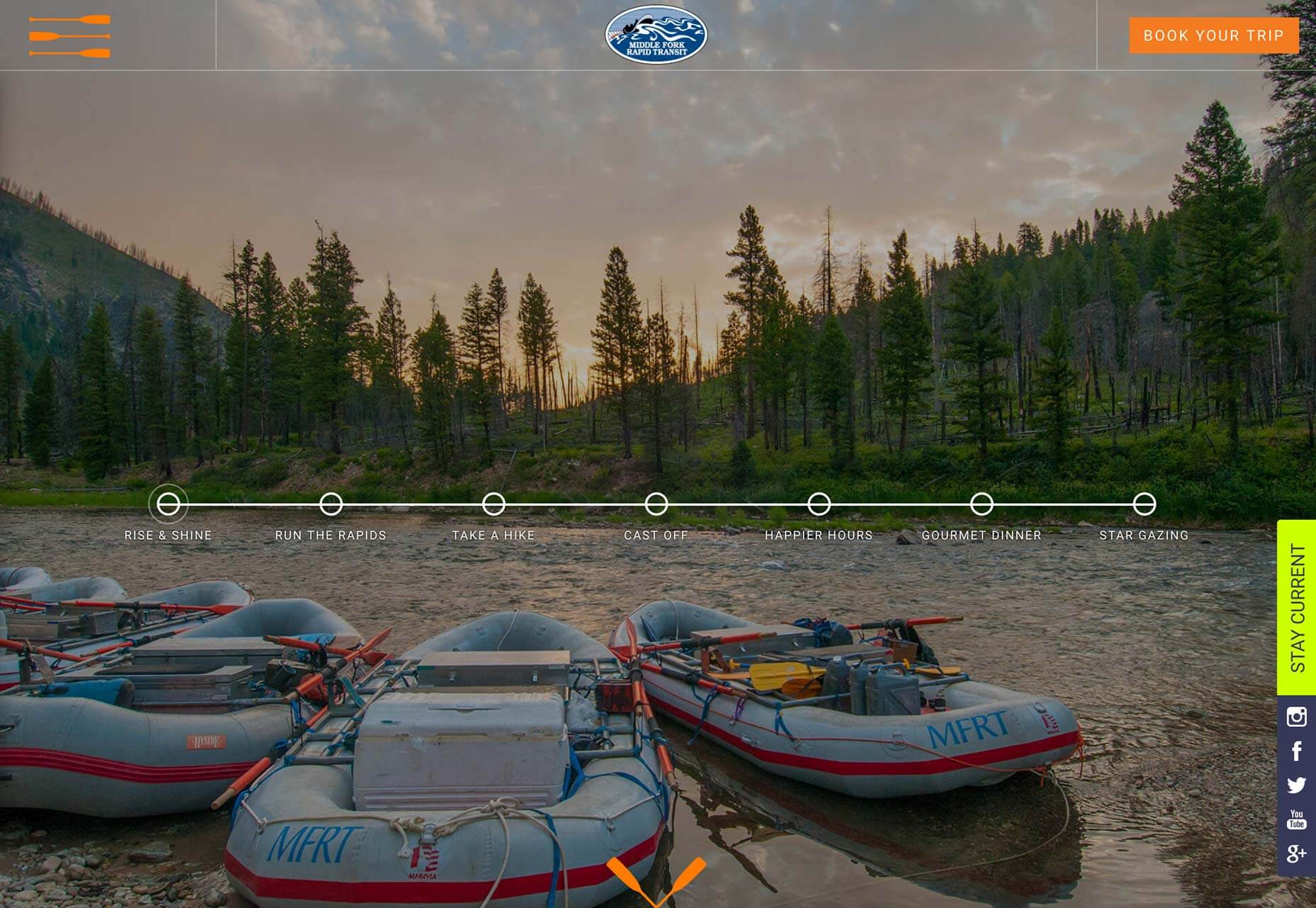


 Every week users submit a lot of interesting stuff on our sister site Webdesigner News, highlighting great content from around the web that can be of interest to web designers.